

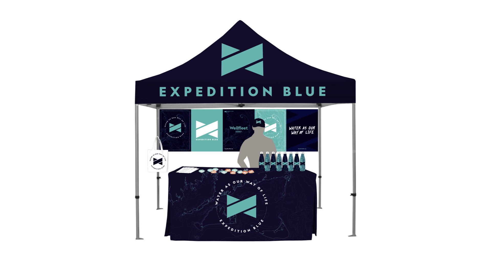
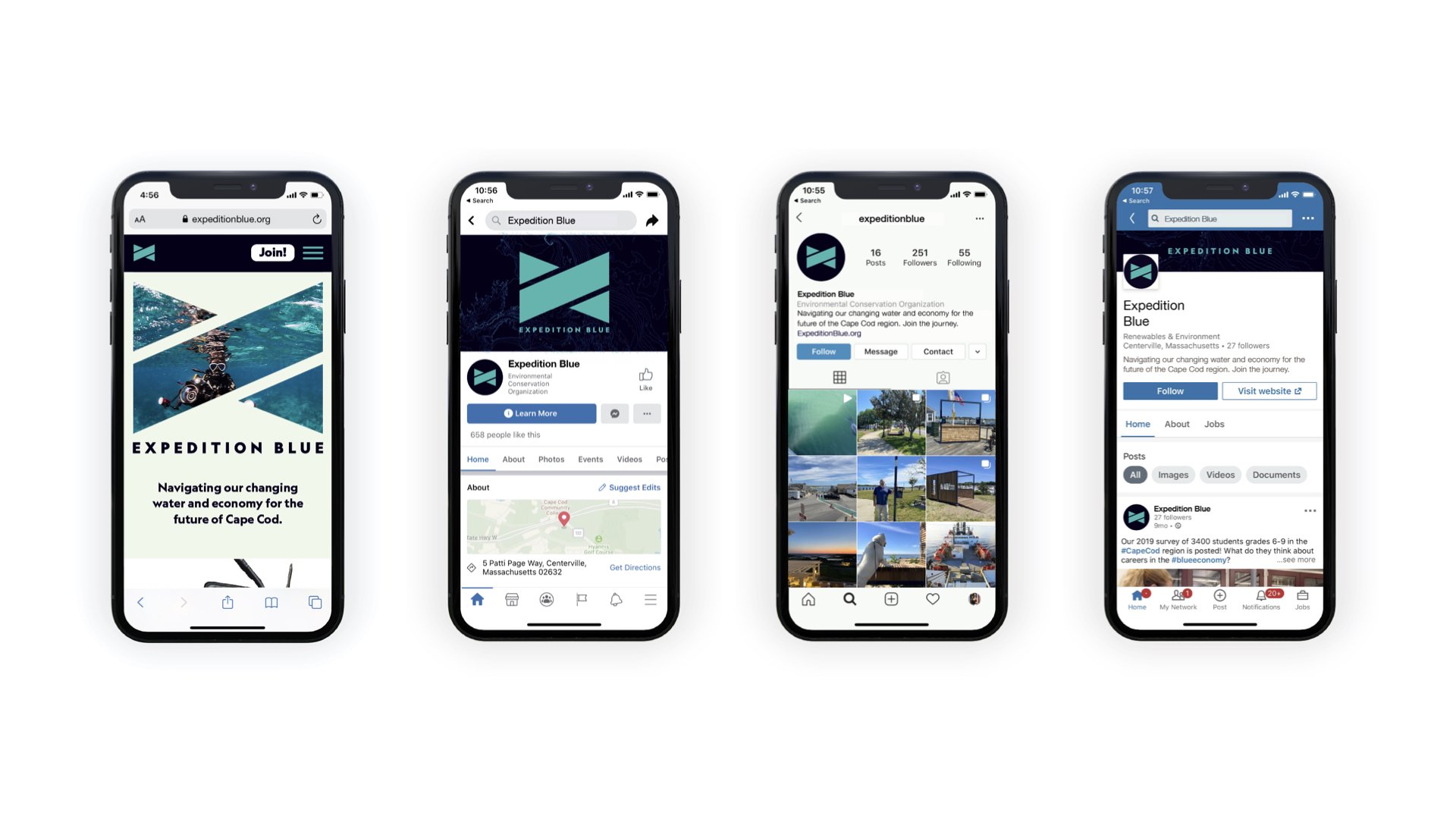
Brand Identity / Marketing Plan / Environmental Graphics
Cape Cod’s Chamber of Commerce is investing in the region’s water-based economy. Their work is part of a larger, global movement to support and strengthen “blue economies.”
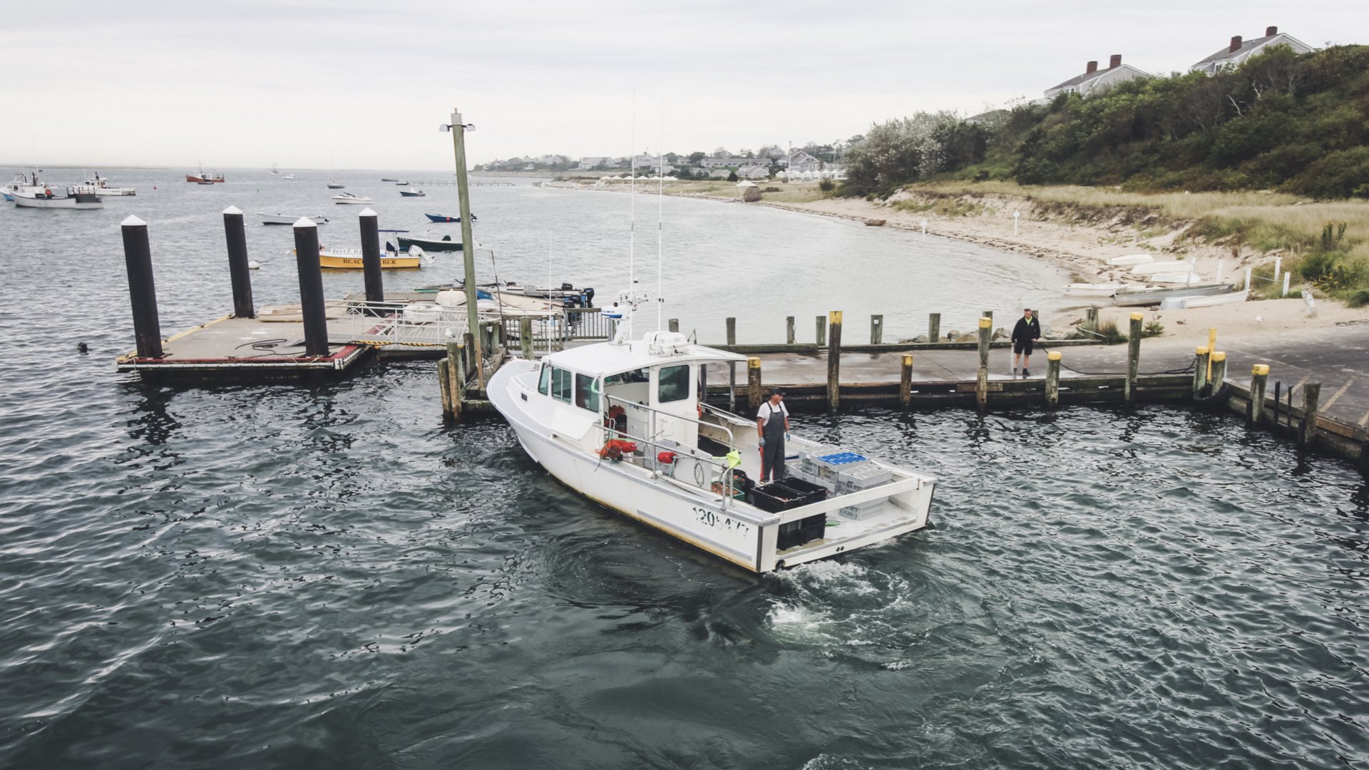
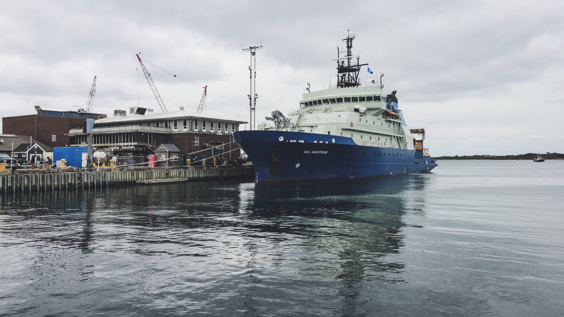
From oyster farmers in Wellfleet to ocean researchers at the Woods Hole Oceanographic Institution, the Chamber is working to raise awareness and expand opportunities for water-based jobs, industries and education.

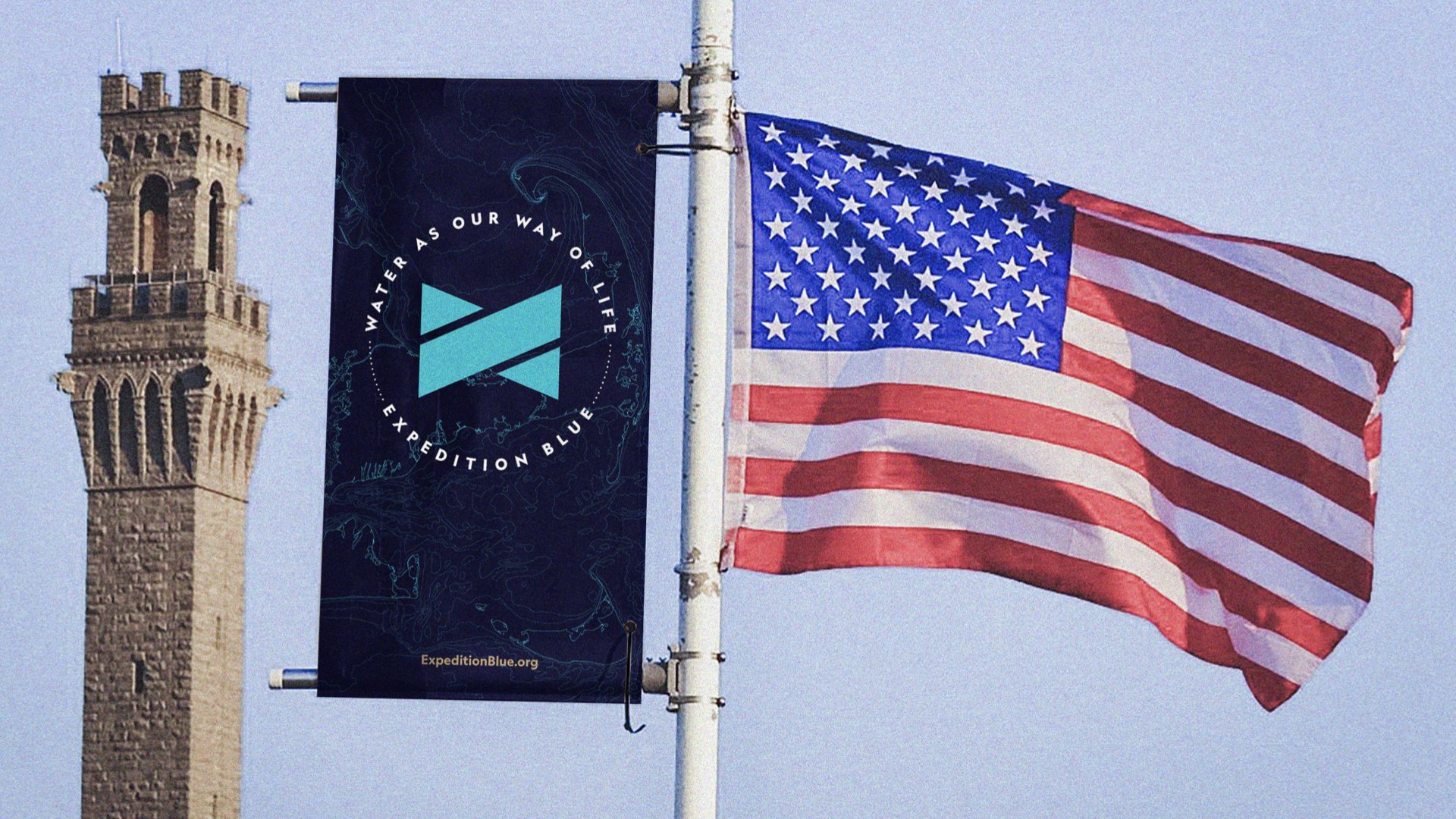
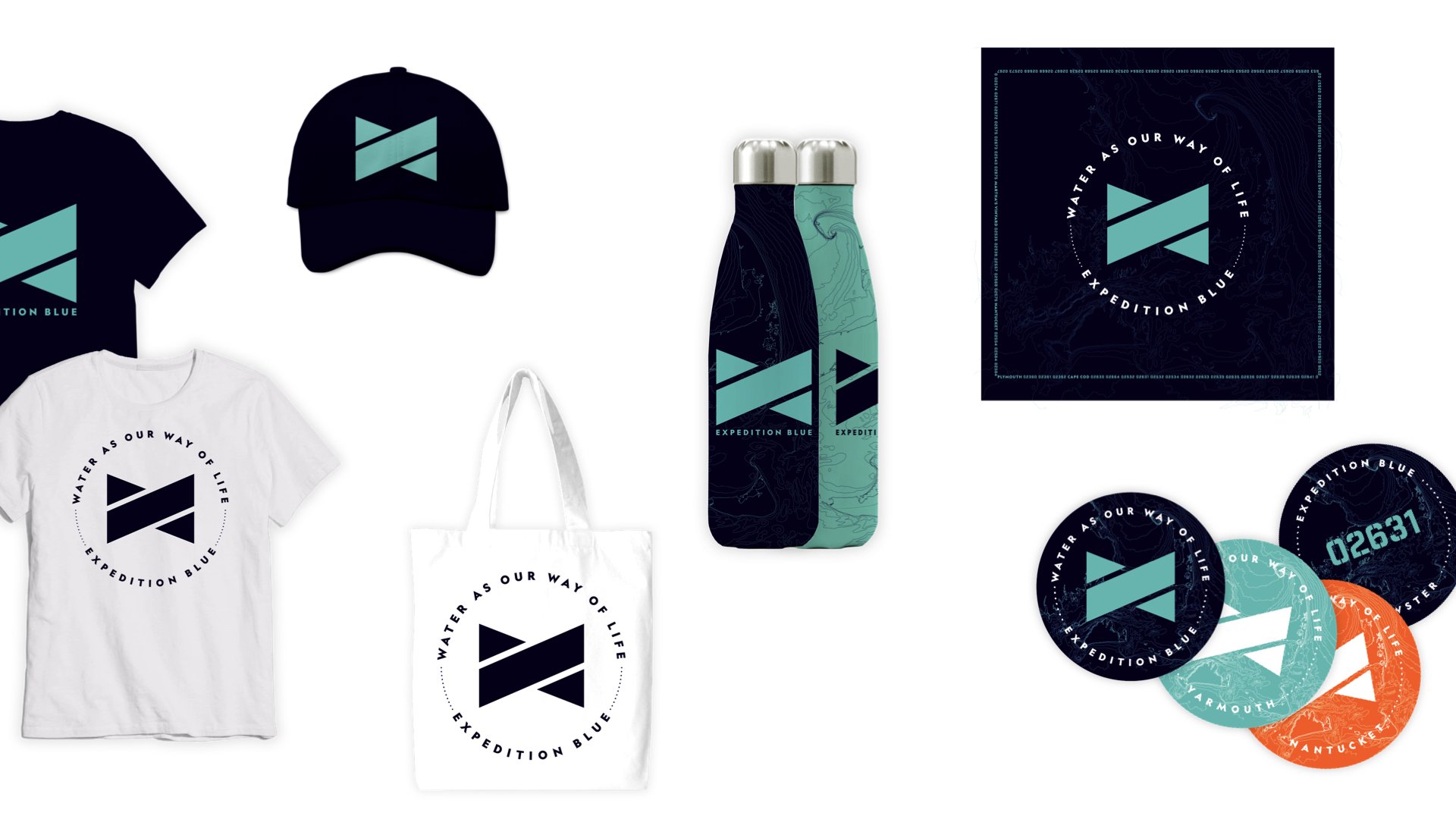
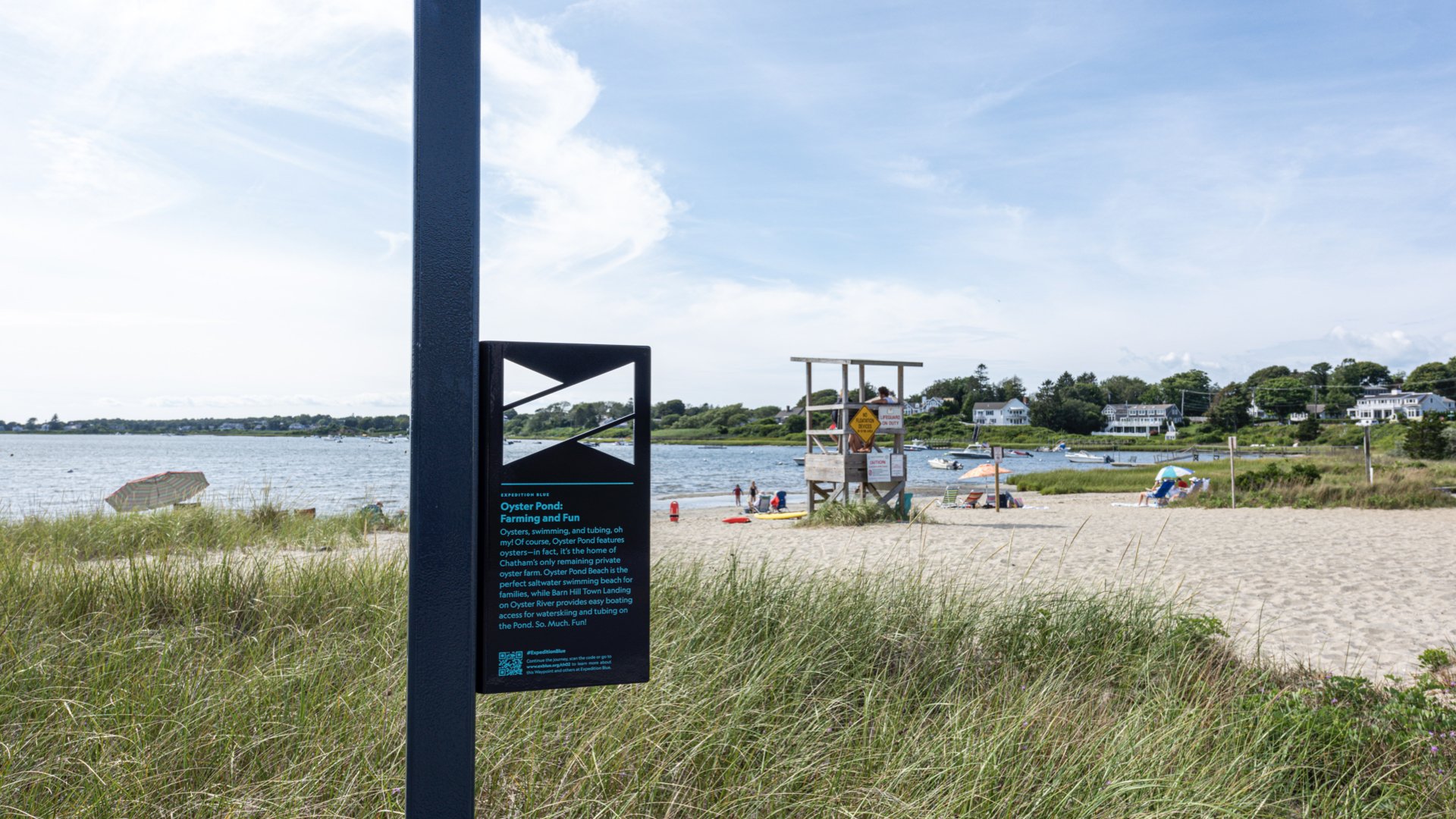
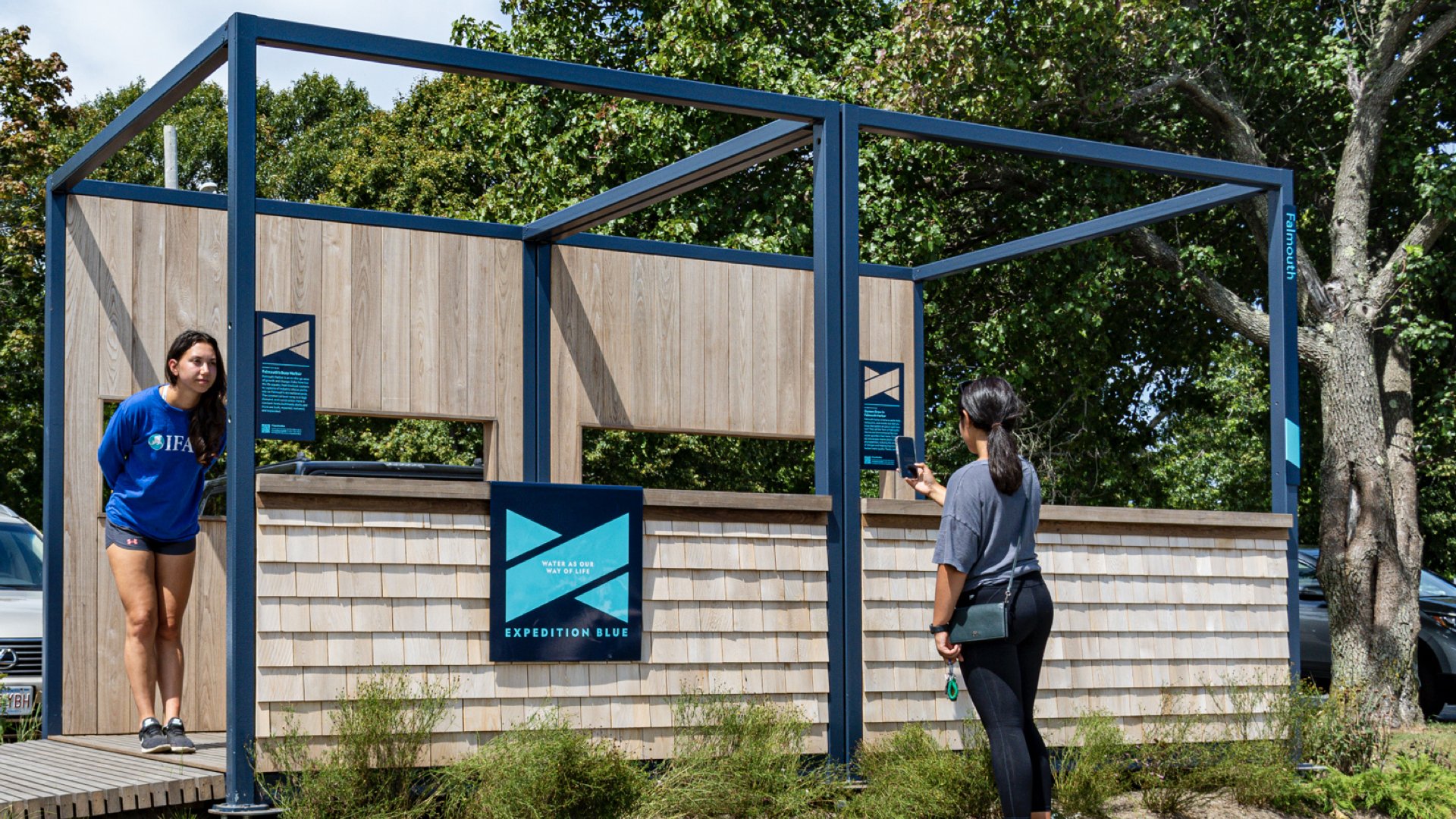
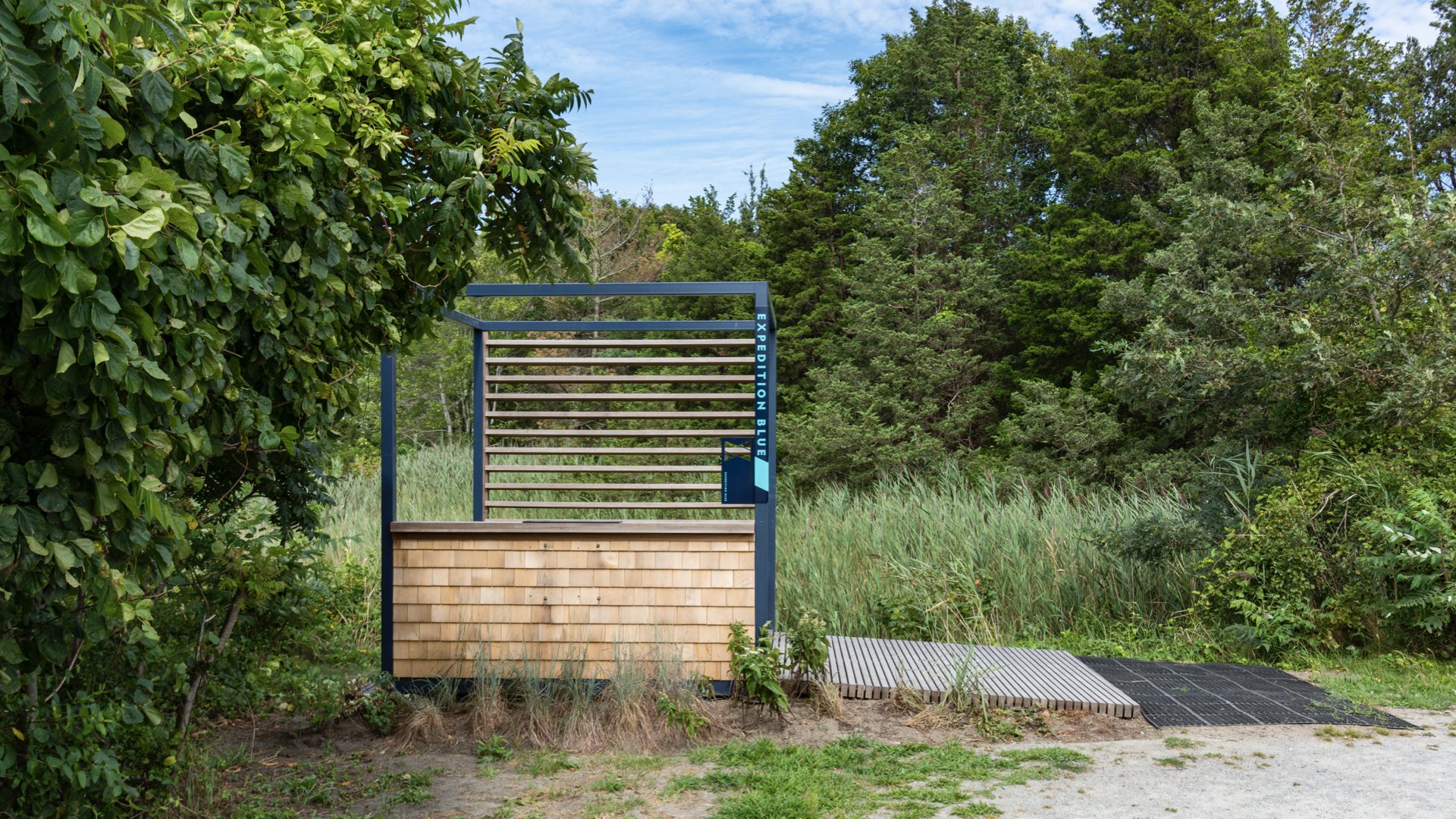
We created a brand-identity system, communication standards and marketing plan—and applied the identity to waypoints located throughout Cape Cod.
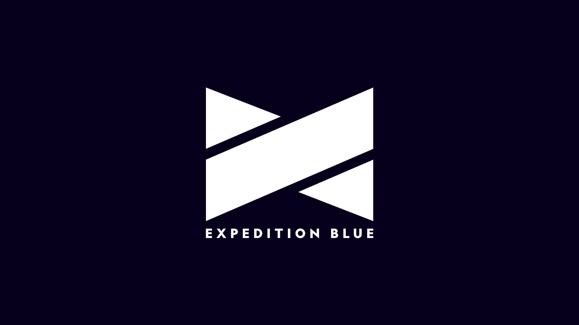
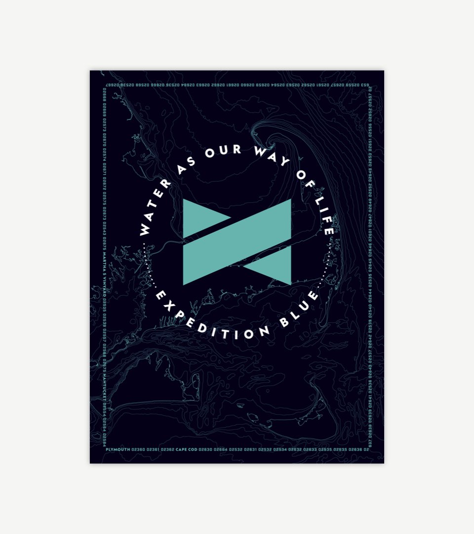
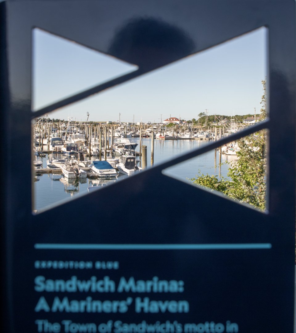
Expedition Blue’s logomark references the letter “X” and represents the intersection of economy and environment. Its proportions and shape, inspired by nautical flags, are designed to enable it to function as a frame or window for viewing the blue economy.


The graphic system is bold, fresh and “of the water.” It integrates colors, typefaces, contour lines and zip codes from the Cape Cod region.


We built tools and tactics around the experience framework that started with building awareness and interest and ultimately leads to building ocean stewardship.

CambridgeSeven led the design of waypoints that are located throughout Cape Cod to reveal the blue economy. We worked with them to integrate the graphic system.
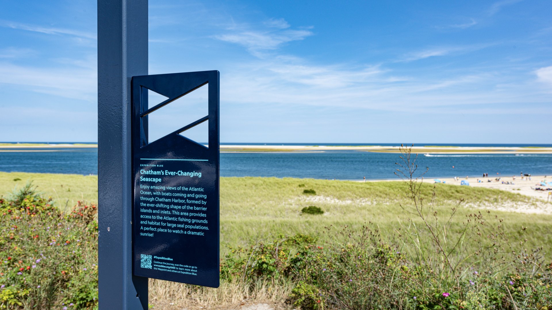
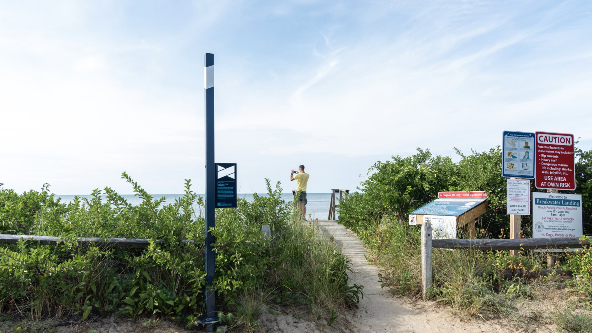
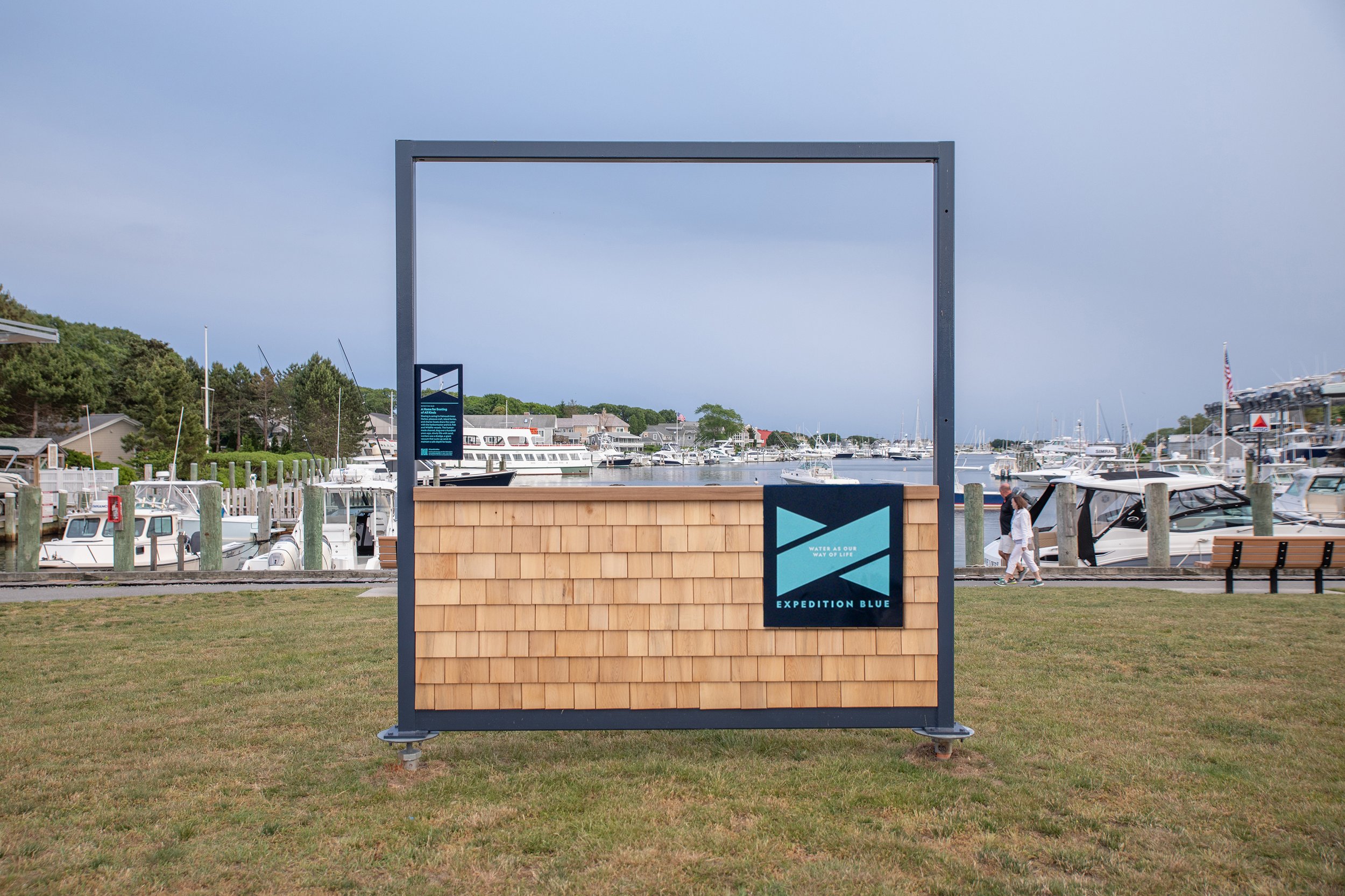
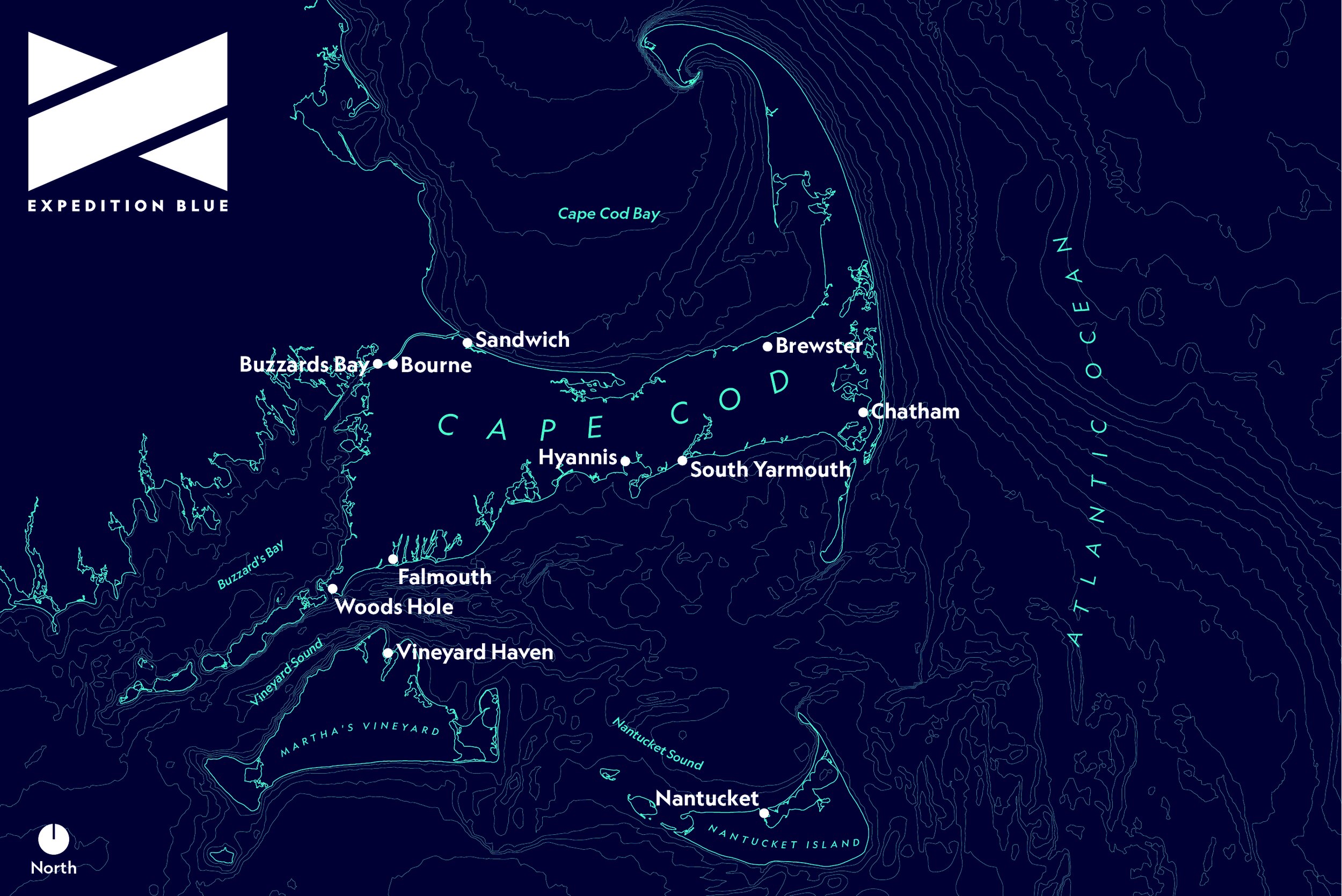
35 waypoints stretch across 100 square miles and 11 villages throughout the Cape and Islands.
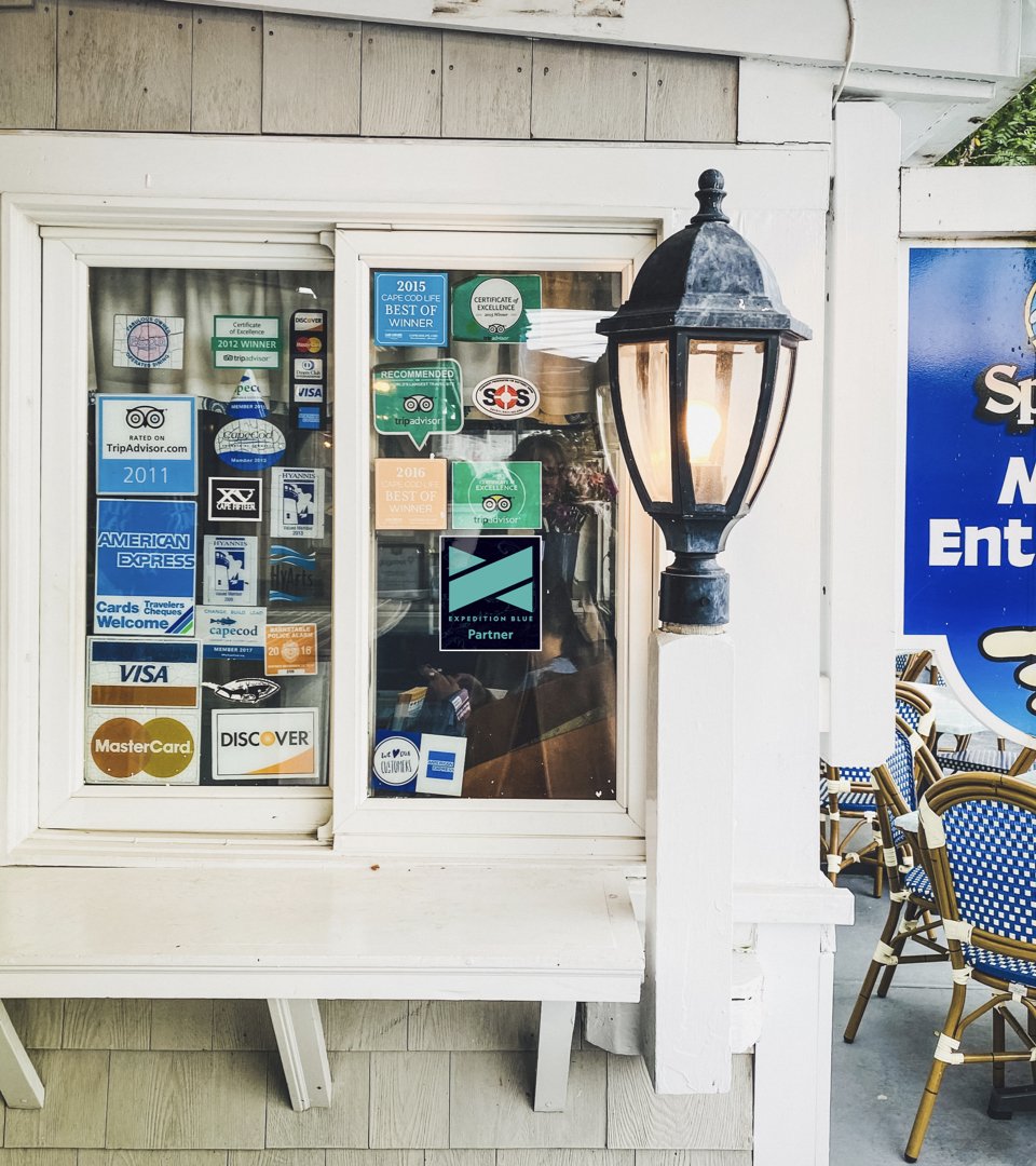
The logomark is used as a frame to reveal examples of the blue economy. A caption accompanies them—and further information can be found via the QR code on each panel.

Special thanks to the dedicated and passionate partners who helped bring this project to life and especially to CambridgeSeven for inviting us to be a part of this special project.
Award Recognition
Society for Experiential Graphic Design (SEGD)
Global Design Awards: Finalist
National Association for Interpretation
Interpretive Media Award, Outdoor Exhibits: 3rd Place