
Brand Identity / Experience Strategy
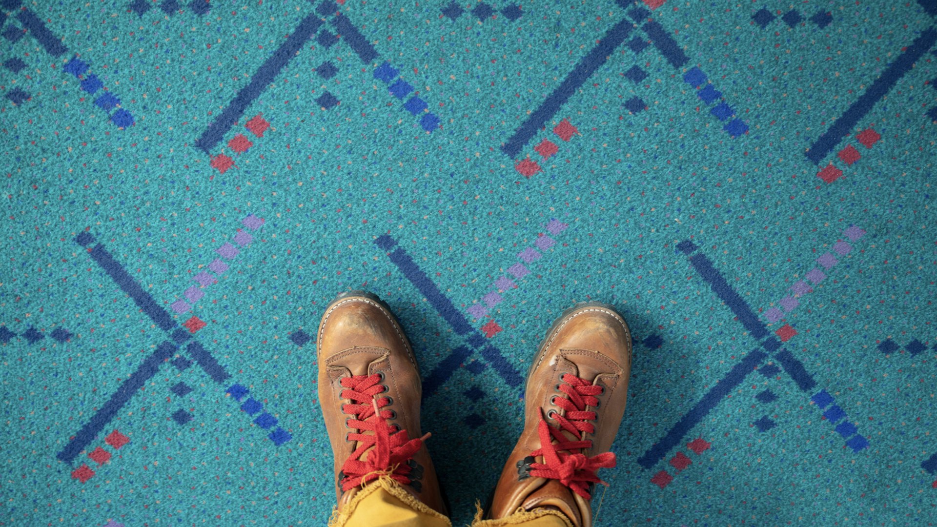
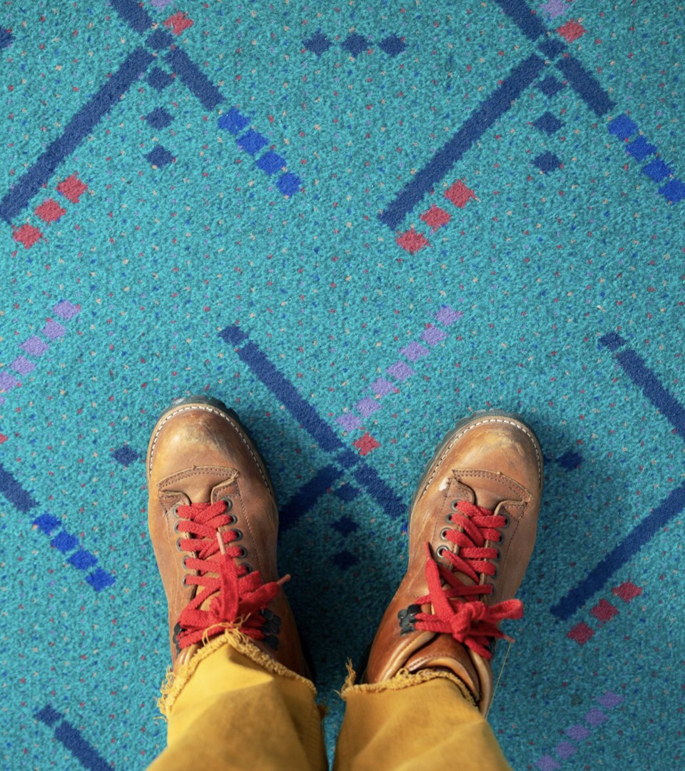
Portland International Airport (PDX) is famous for its local food, shops and of course, the carpet. It’s no wonder it consistently wins the title of America’s best airport.
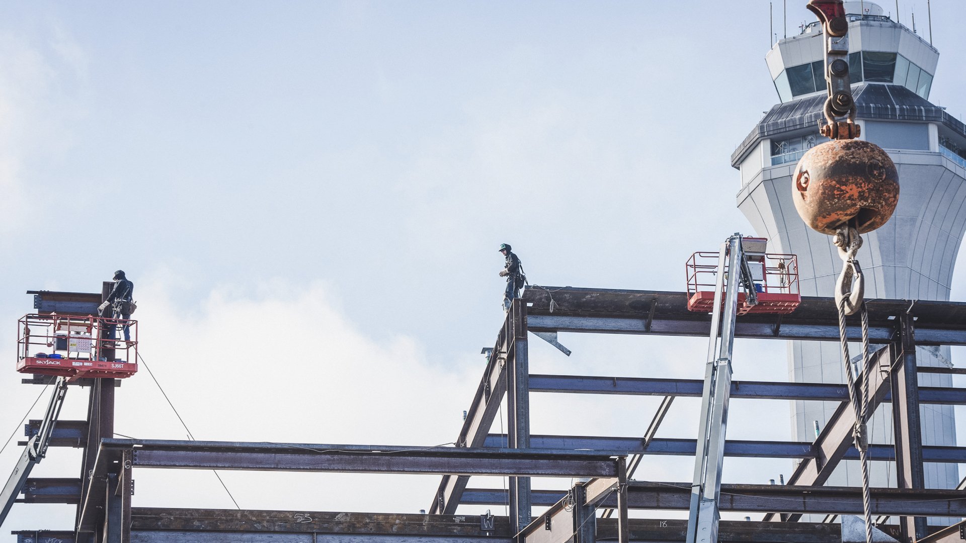
PDX was preparing for 5 years worth of construction, and anticipated more than a little disruption for travelers and employees.
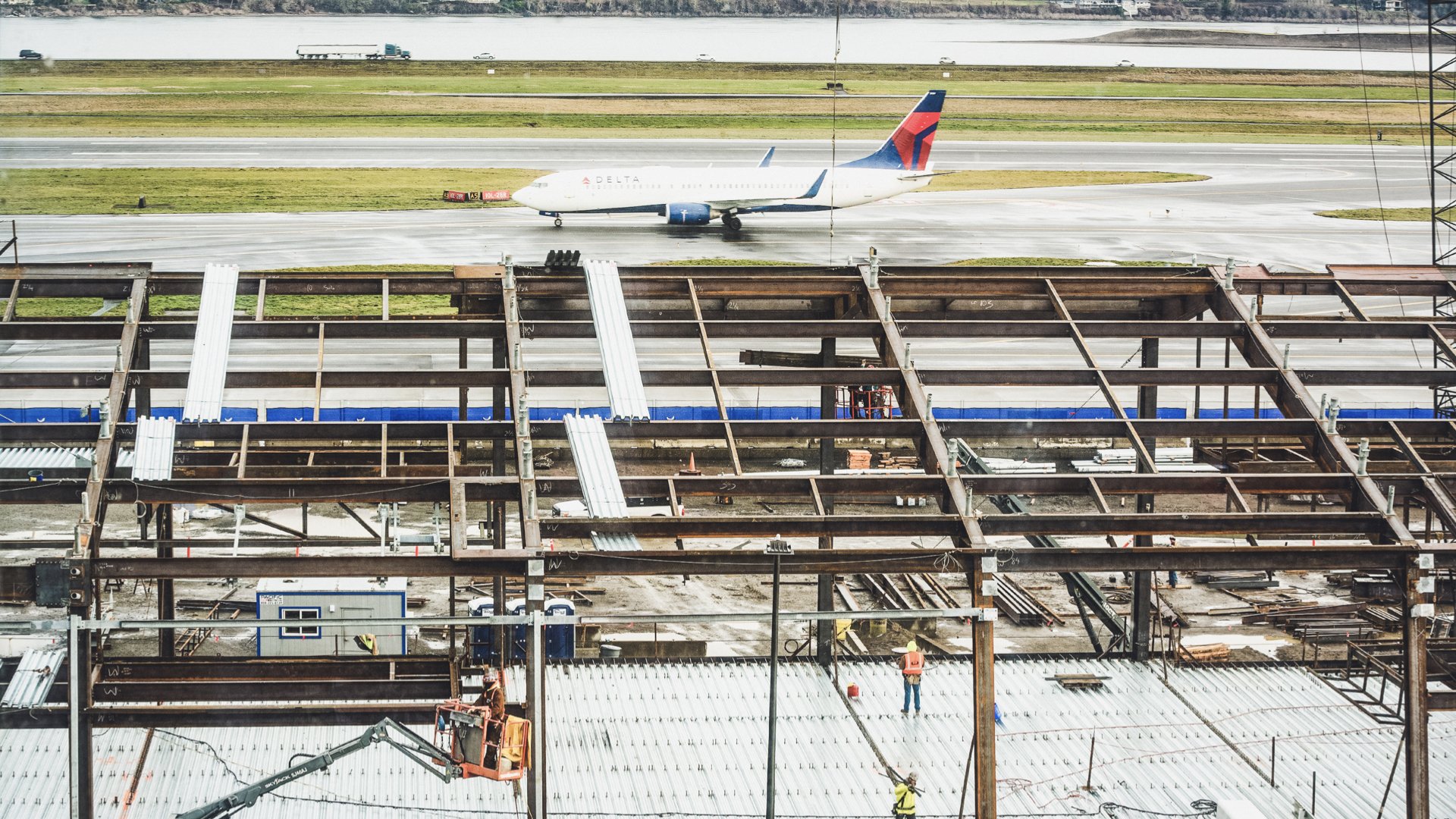
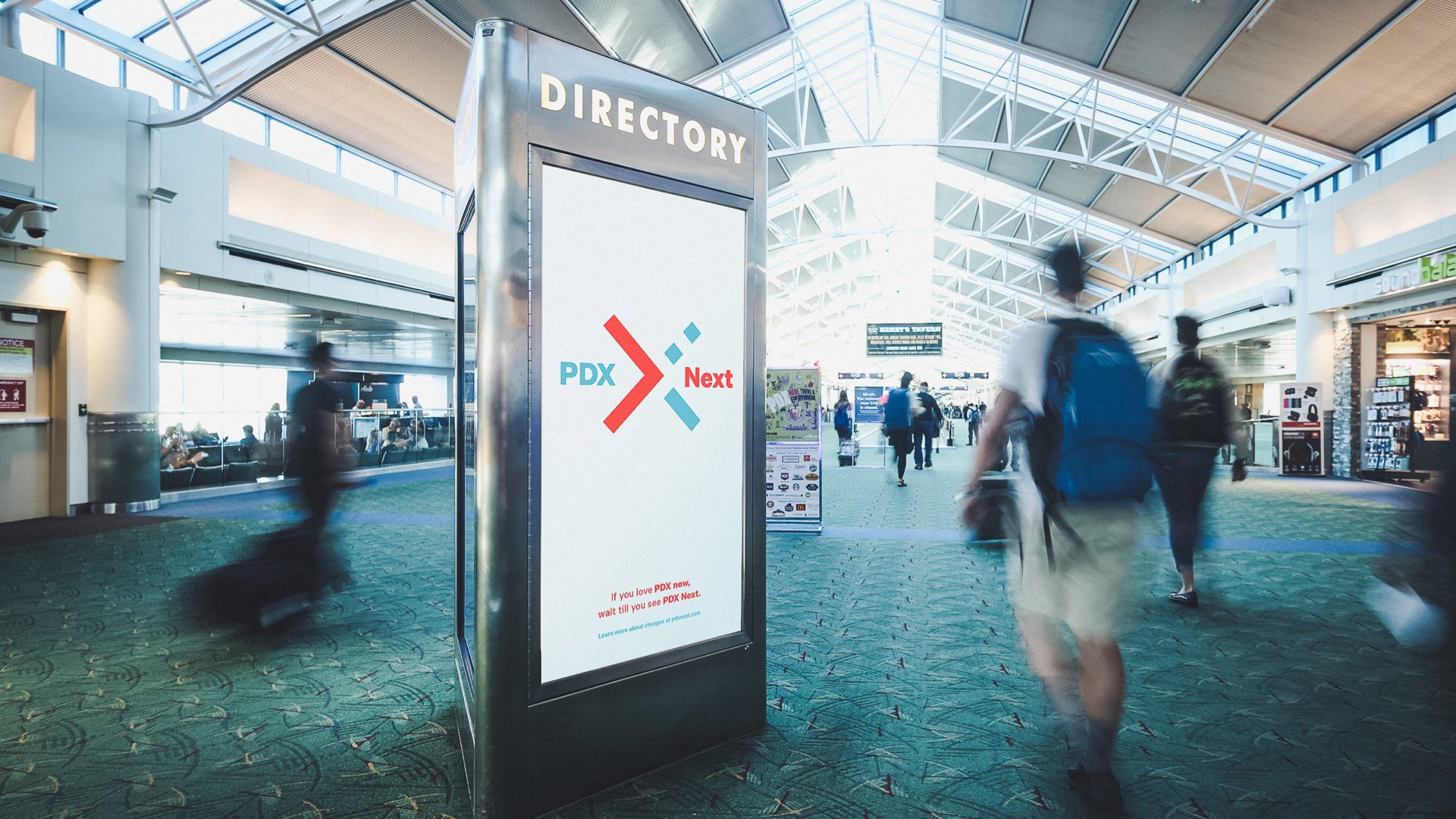
In 2018 the airport hired us to develop a visual identity and communication strategy for construction: PDX Next.
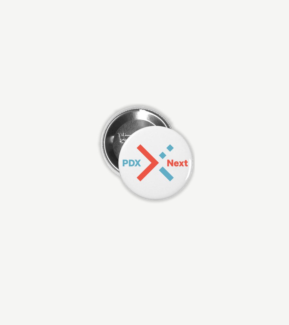
We started with building a visual identity—inspired by the original airport runways and popular carpet—but also pointing to the future.

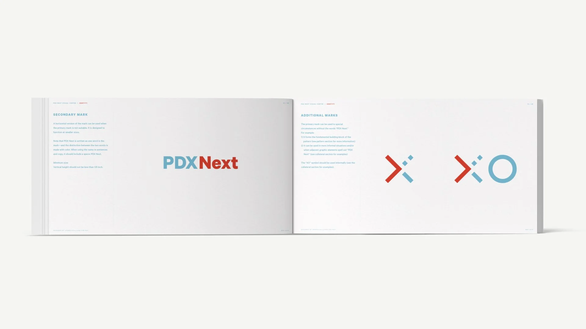
The primary mark represents forward motion and enthusiasm for the future.
Its precision and boldness embody confidence and preparedness for the construction work and disruptions to come.
And, of course, the mark is reminiscent of the well-loved carpet—leveraging existing enthusiasm, awareness and familiarity.
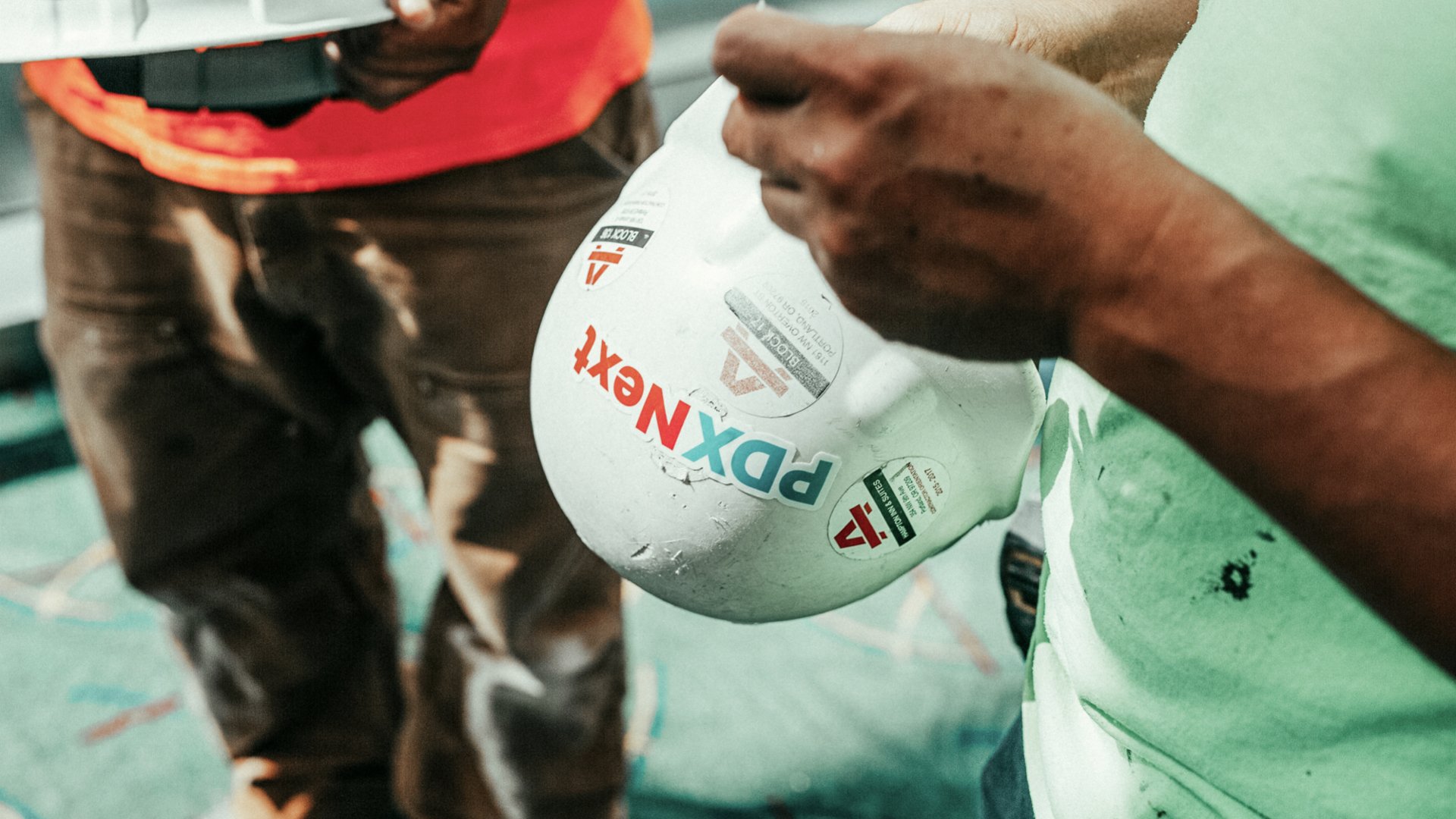
From there, we built a complete visual identity and toolkit for PDX to maintain consistency across various construction projects and touchpoints.
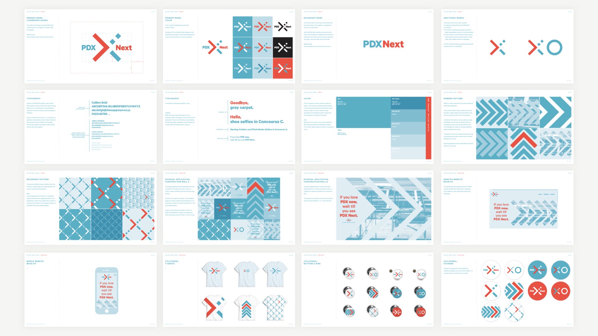
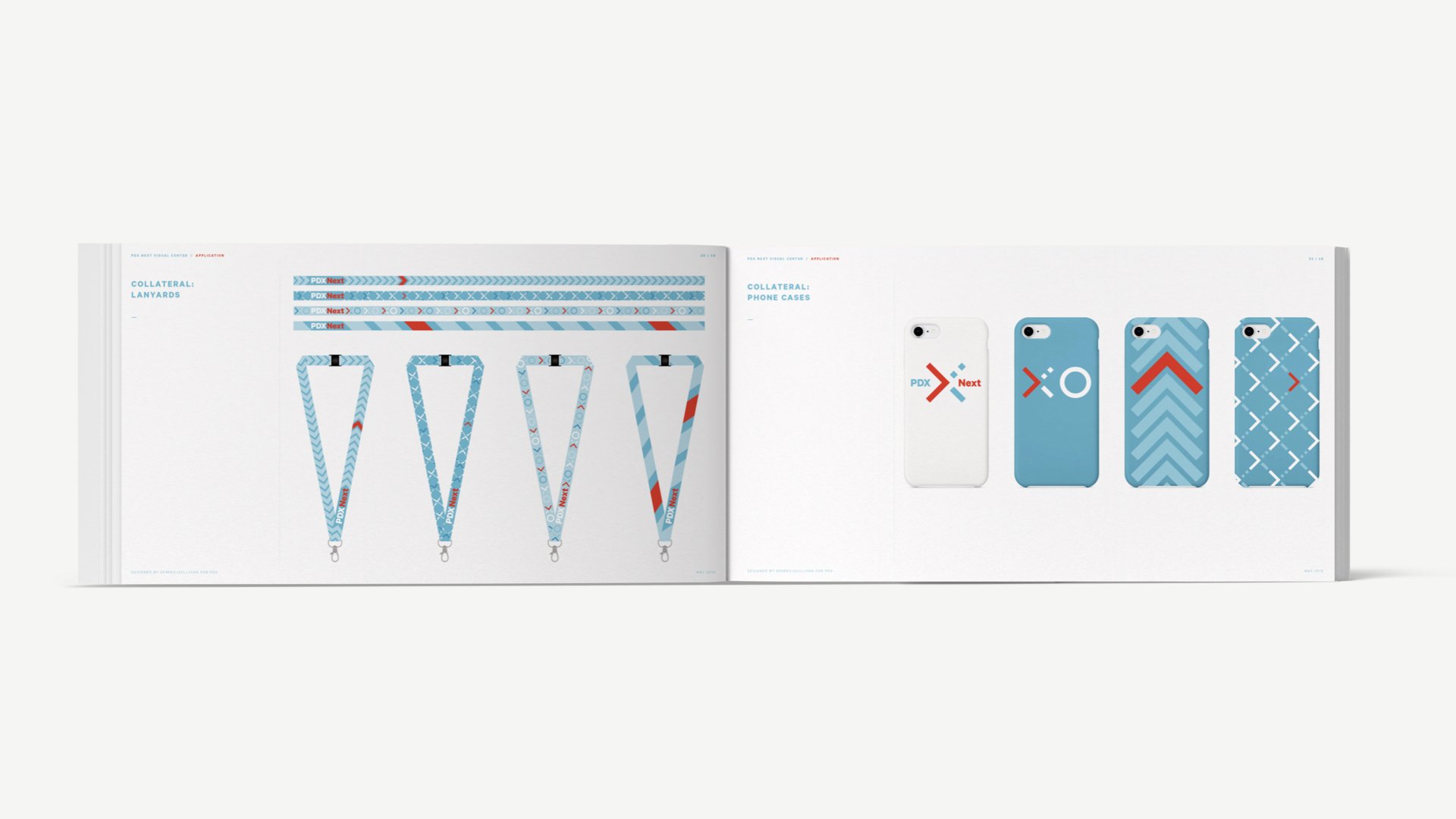
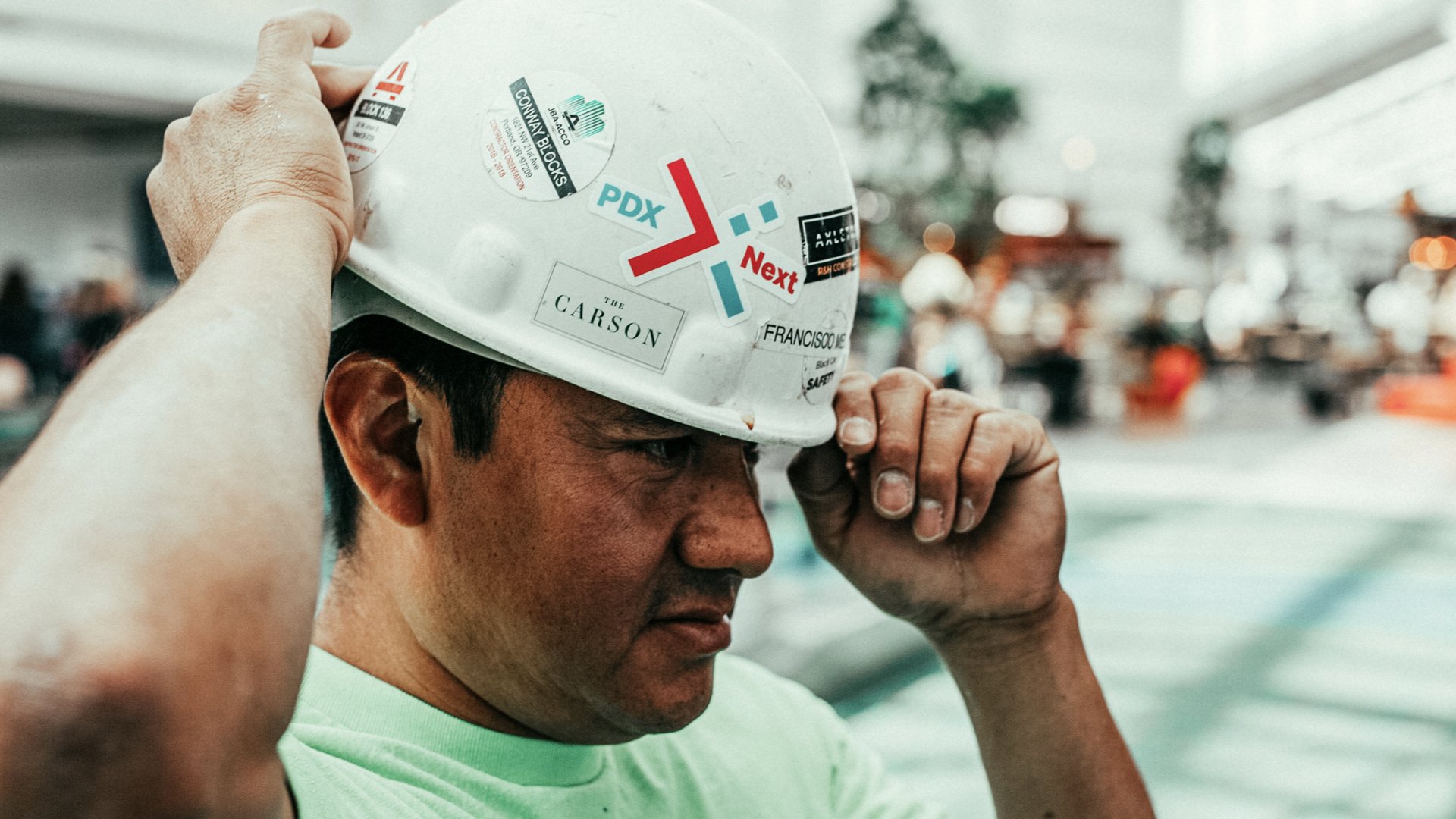
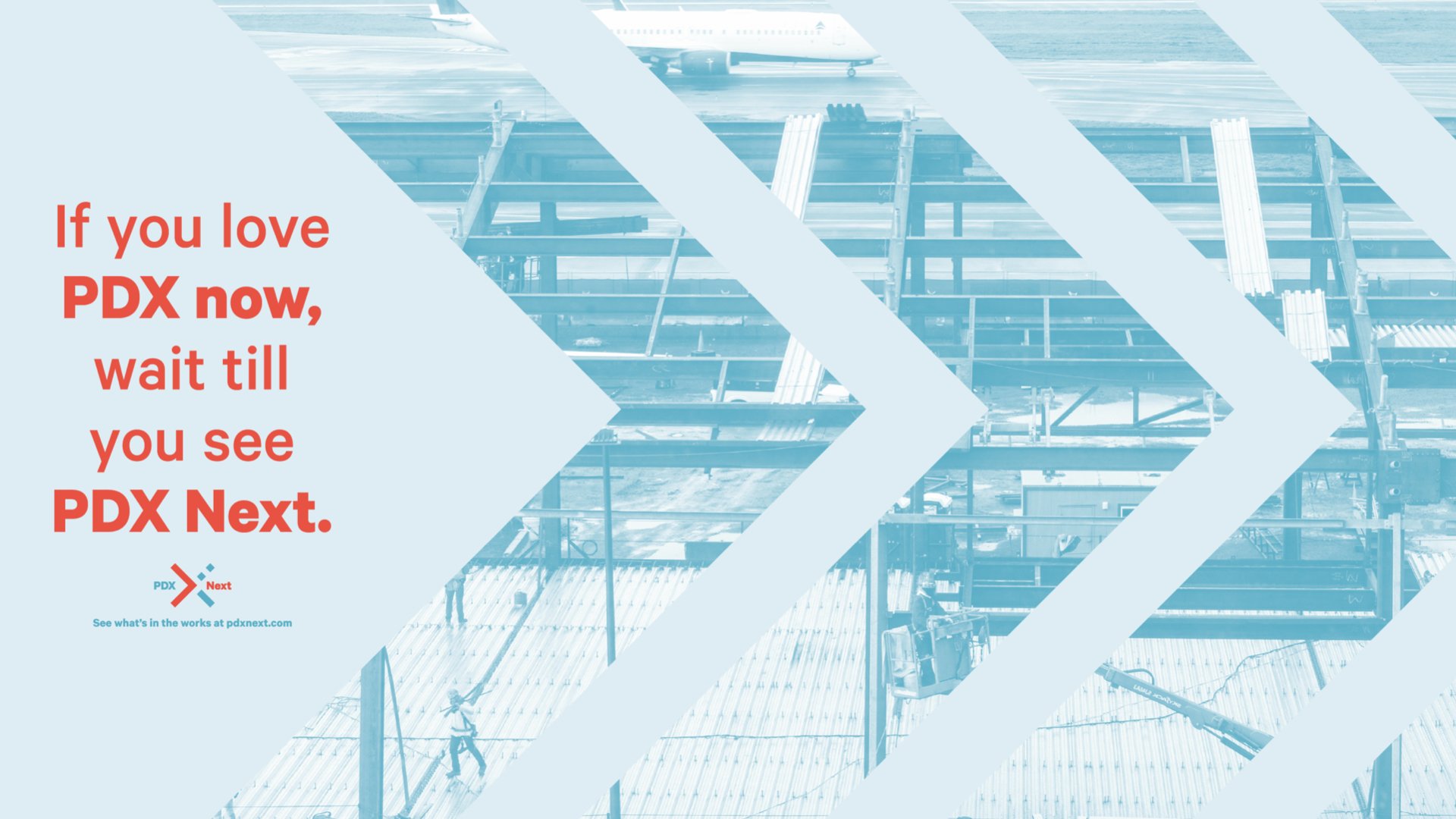
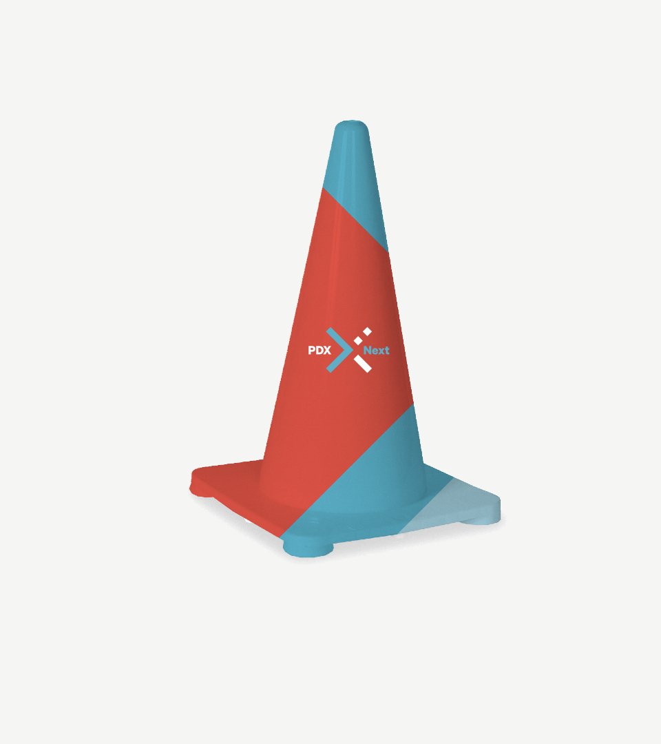
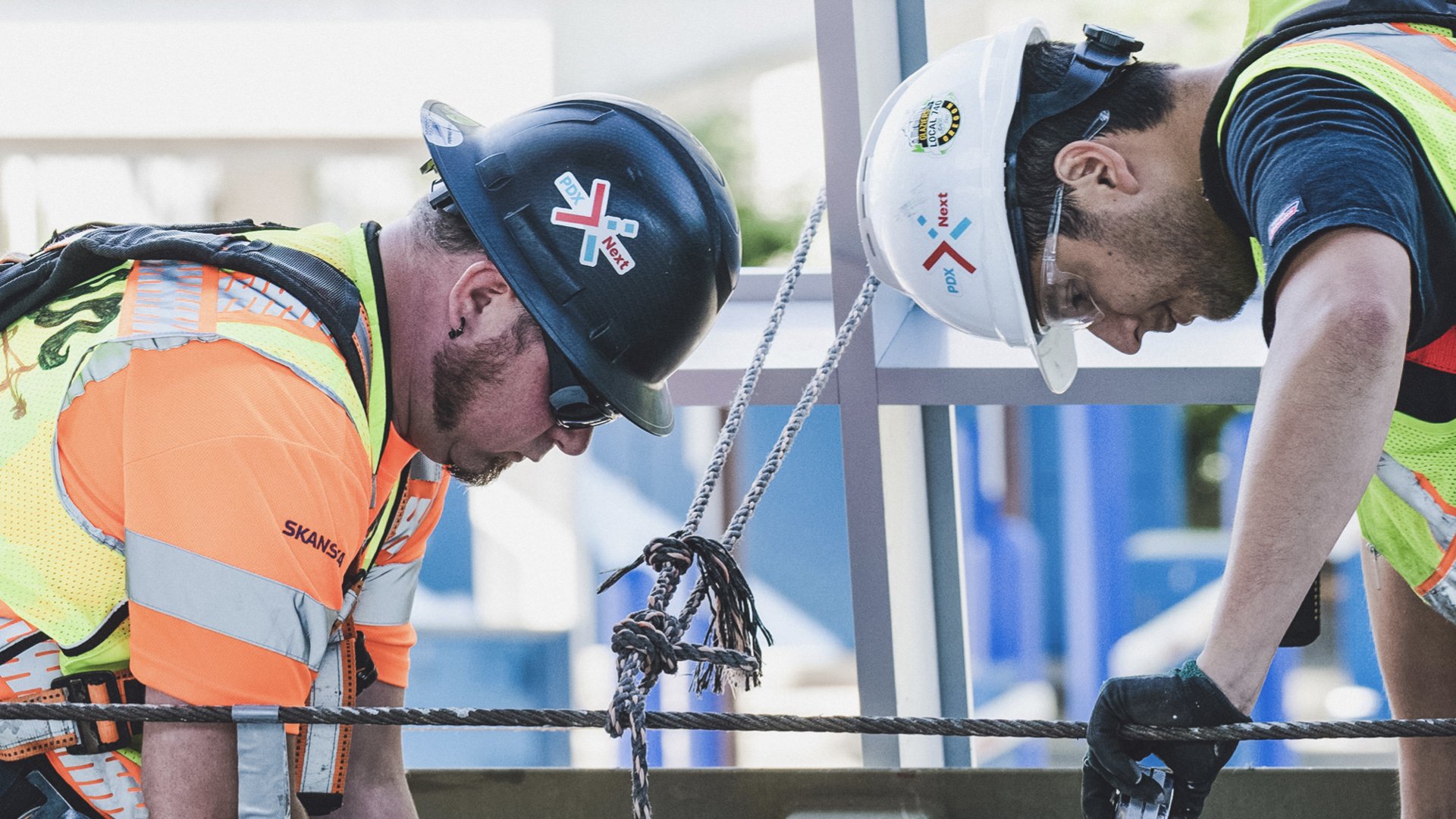
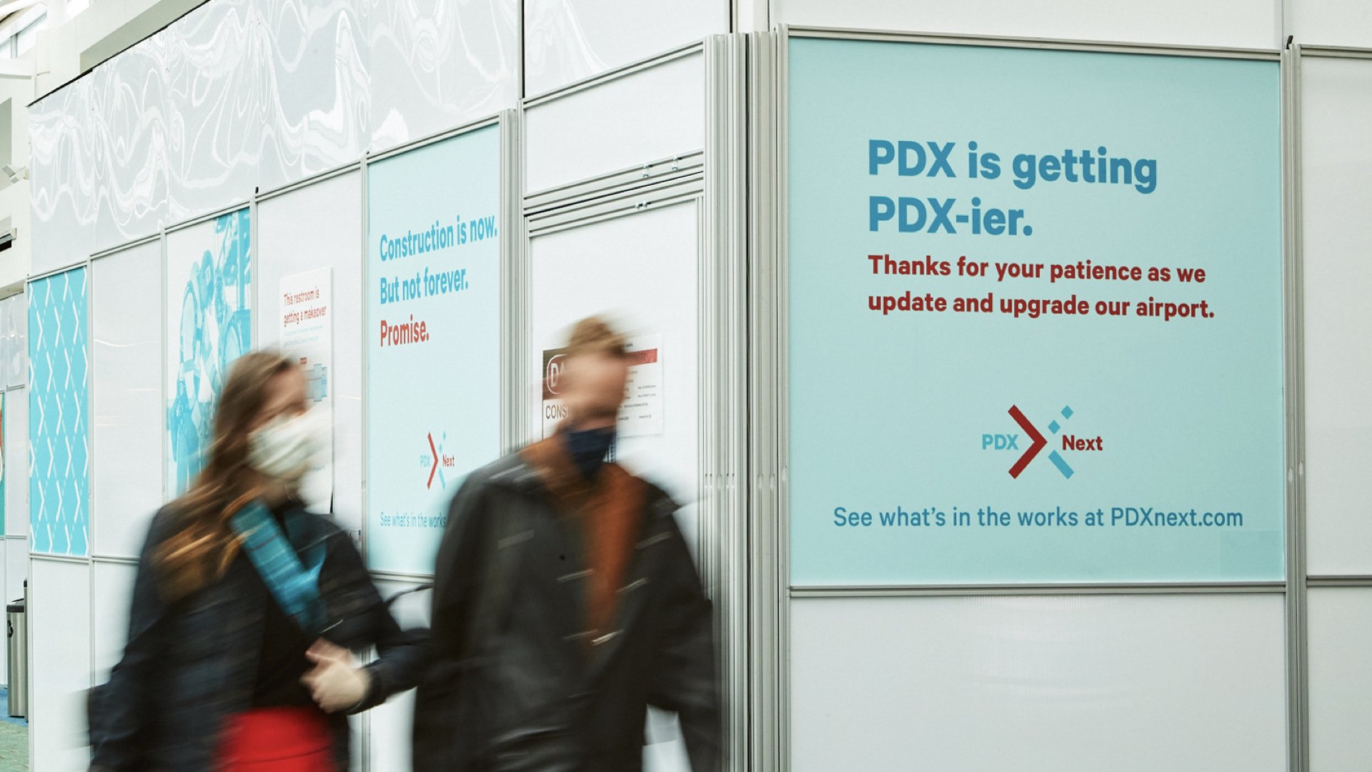
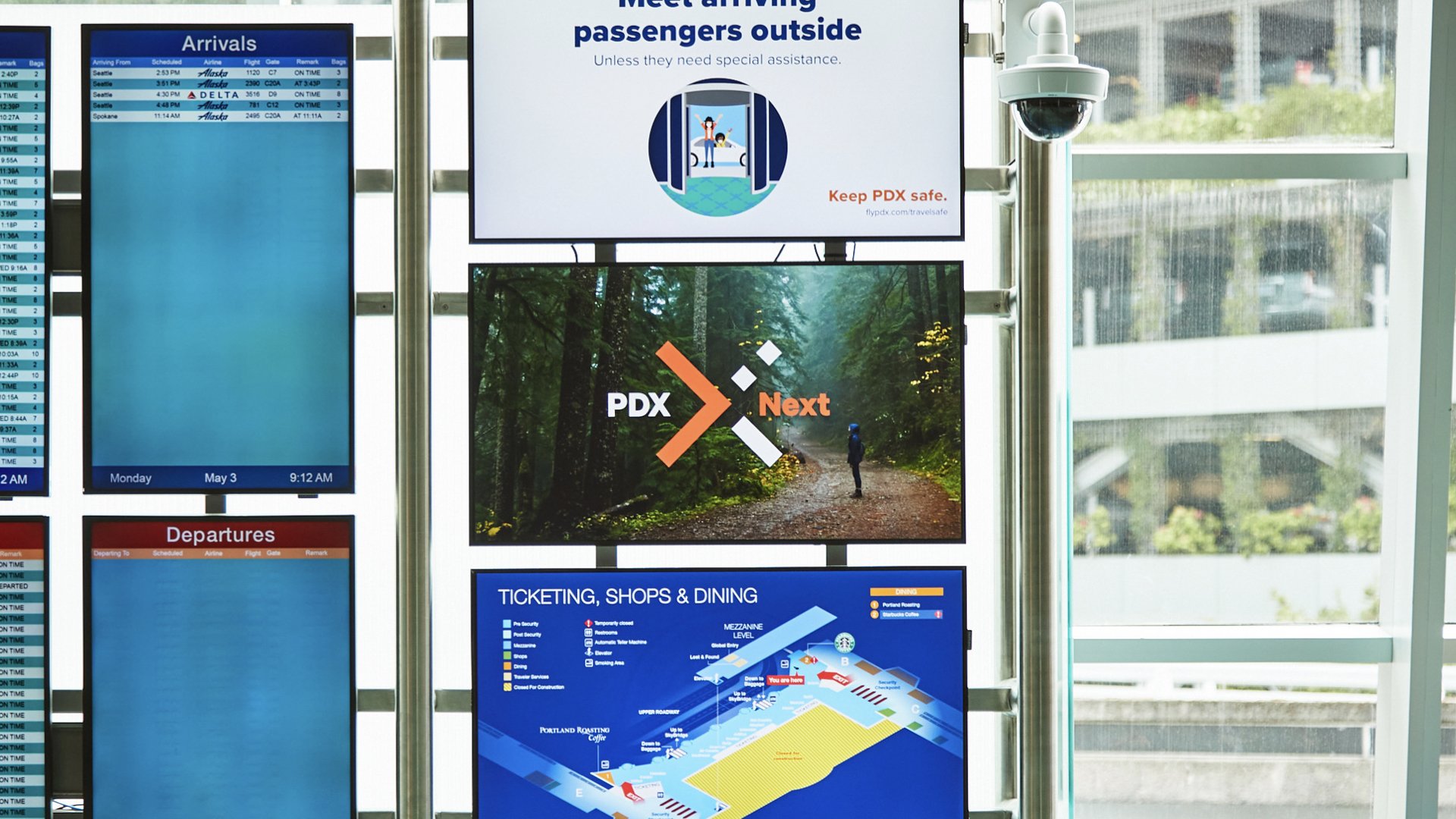
During a time that could be considered the most disruptive for travelers, the PDX Next visual center uses tone, color and pattern to bring delight to construction walls, cones, uniforms and helmets.
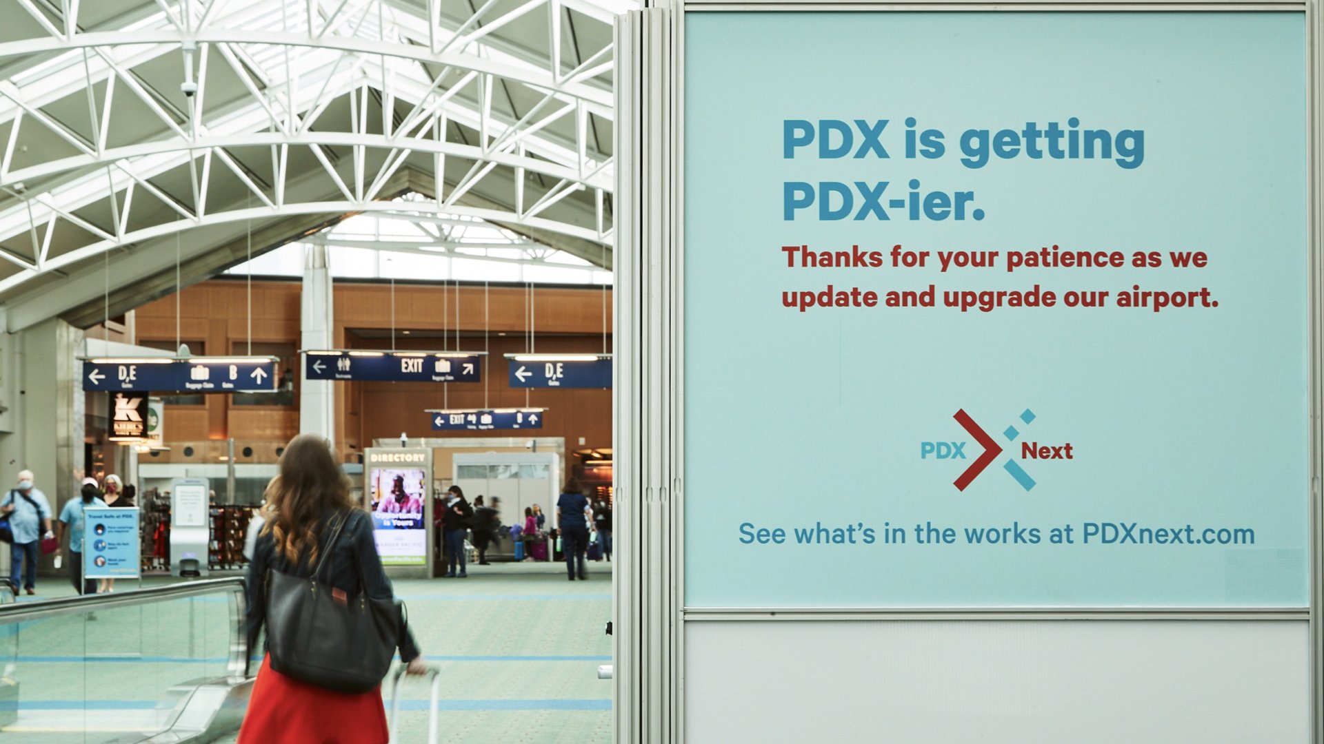
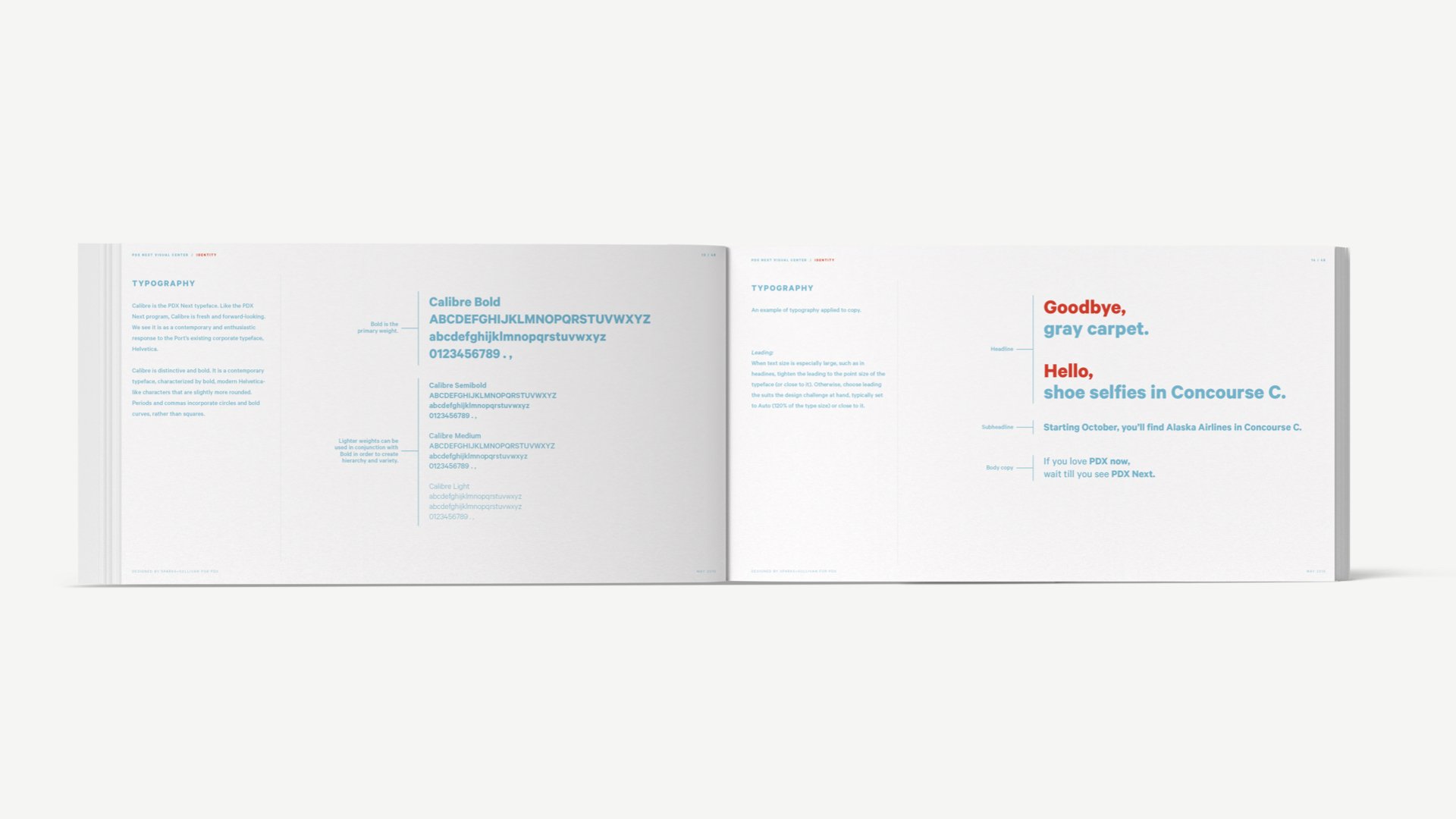
Writing and copy, by several talented contributors, is light-hearted, fun and sympathetic, just like PDX.


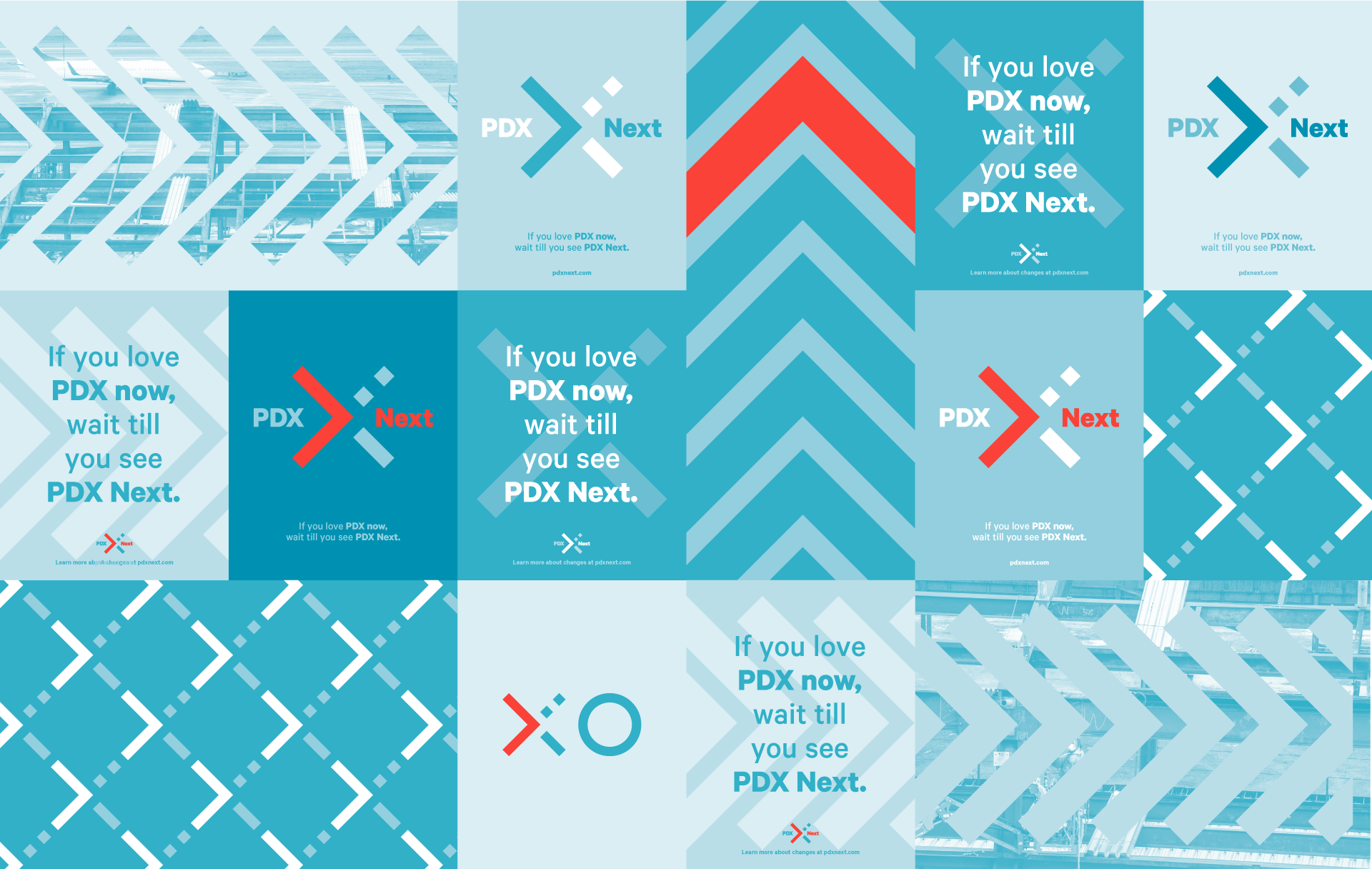
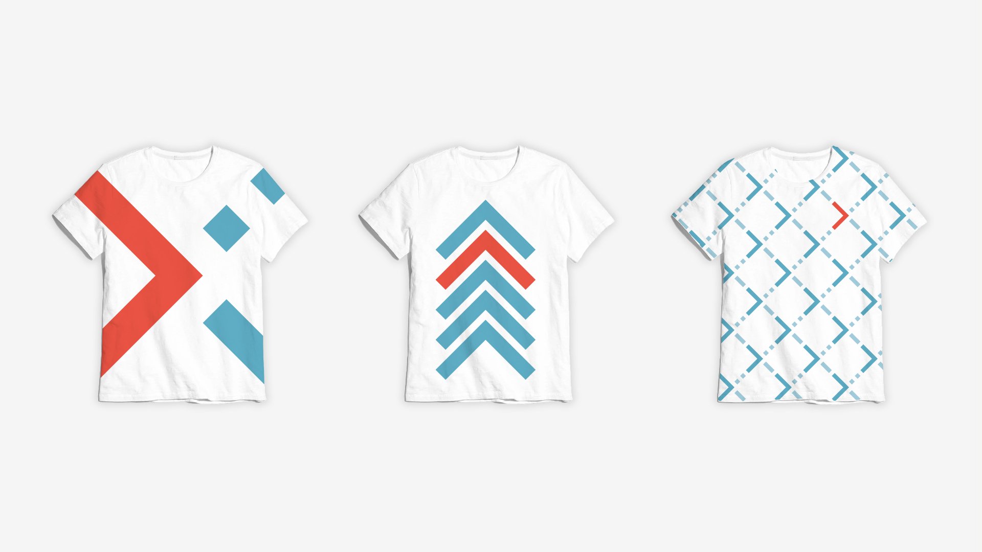
The color palette is composed of blues and greens—like the airport’s interior and surrounding landscape—and accented with a pop of “salmon” to ensure that the system fits comfortably in the spaces but is also able to stand out.


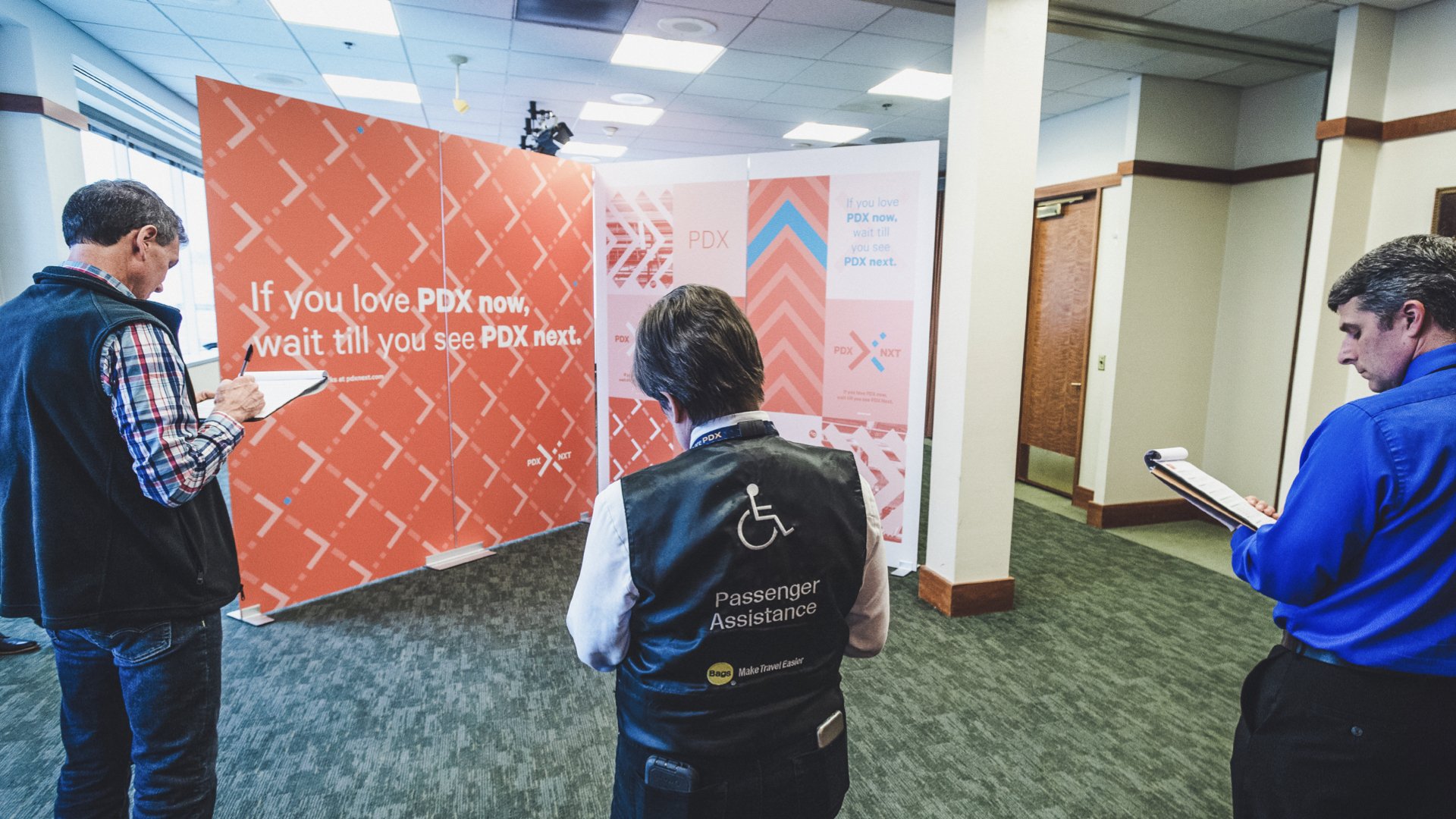
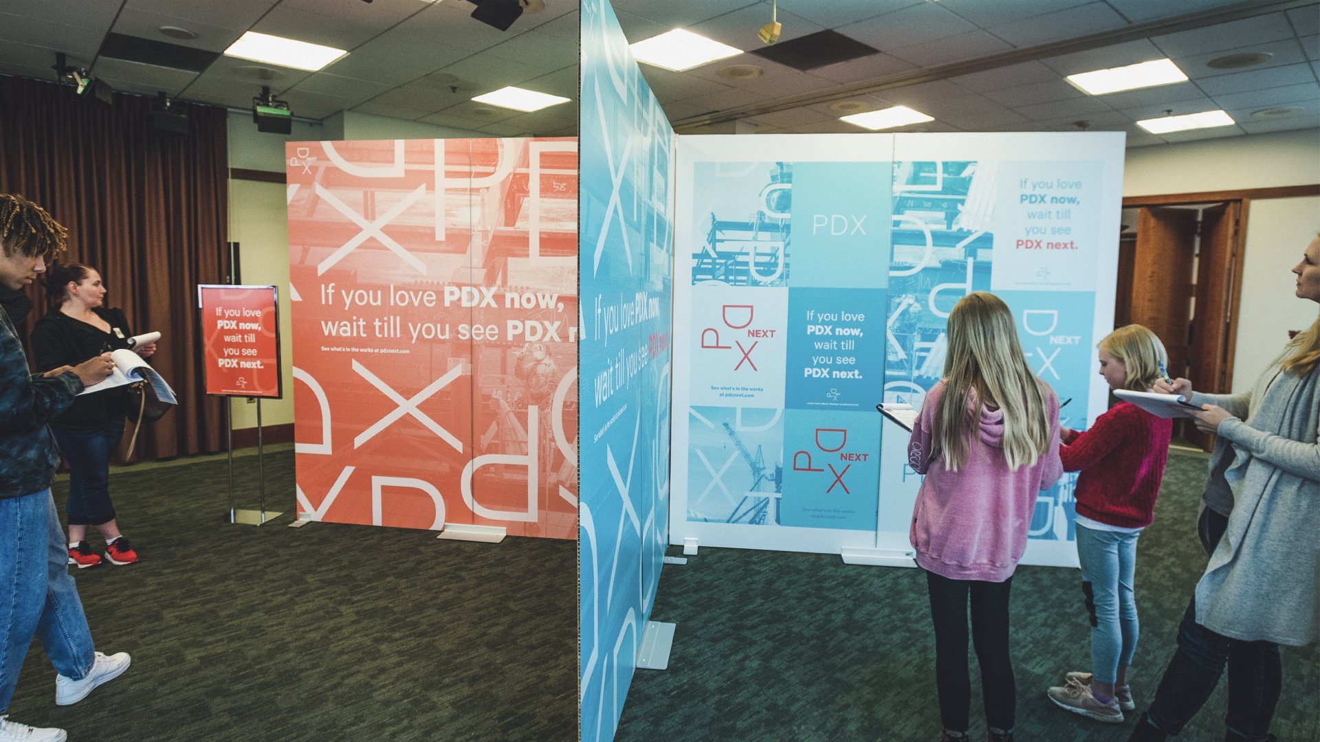
Our client team loved it, but that wasn’t enough. We needed to work with travelers and employees to see what the mark, visuals and communication meant to them, and what questions they had.
So we designed prototypes to get impressions and immerse people in several variations of branded experiences.

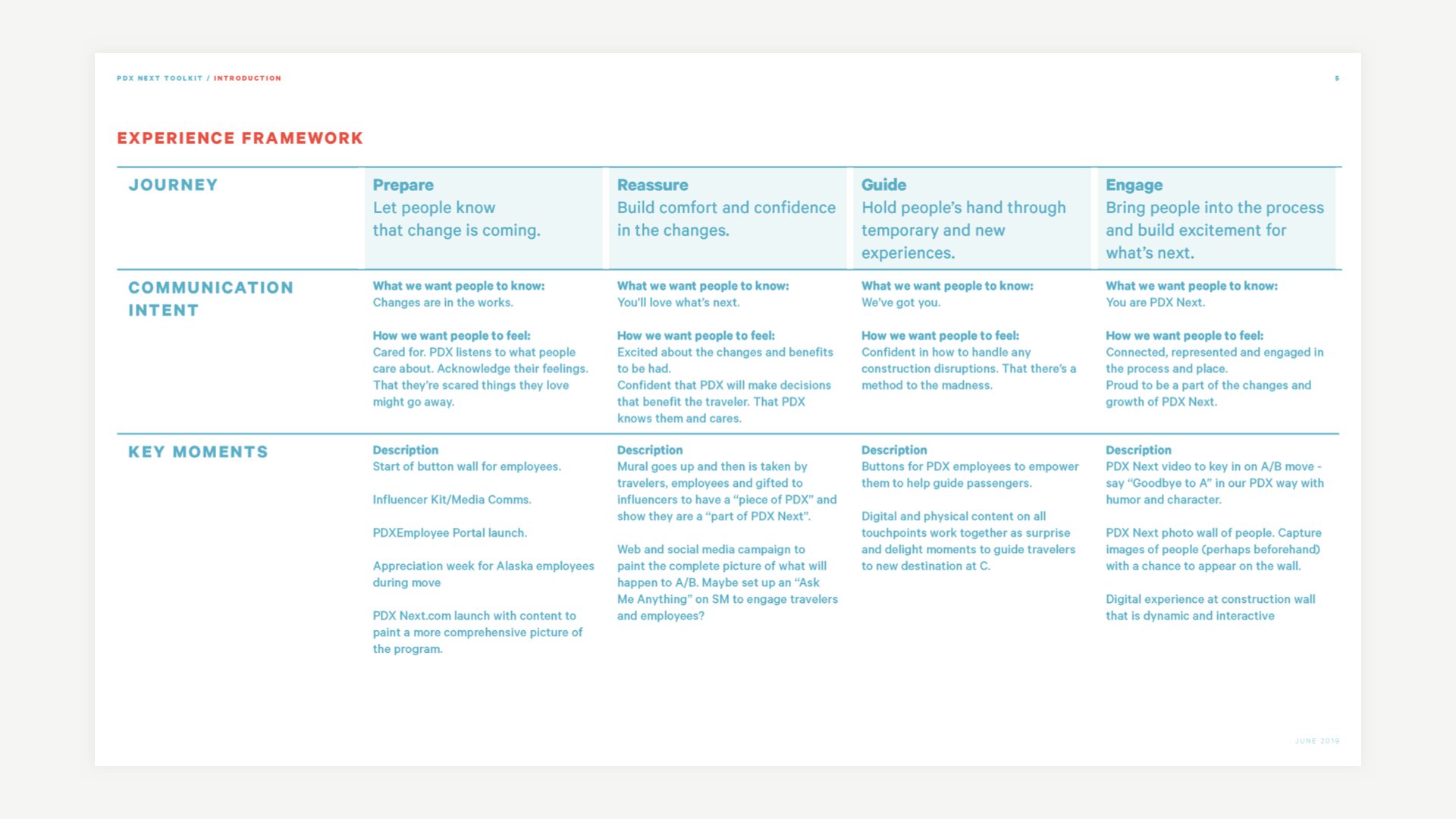
We honed the graphic system, wrote creative briefs and created an experience framework to guide the future campaigns and communications that would be built on the toolkit’s foundation—recognizing that change is hard and guiding people through the experience is critical.
During the Summer of 2021, with construction disruptions in full swing, PDX was once again voted America’s Best Airport.

Awards
IDEA Silver Award 2023
Work like this is a group effort.
Thanks to these incredible collaborators!
Award Recognition
Industrial Designers Society of America (IDSA) International Design Excellence Awards (IDEA): Silver