Brand Identity / Brand Experience

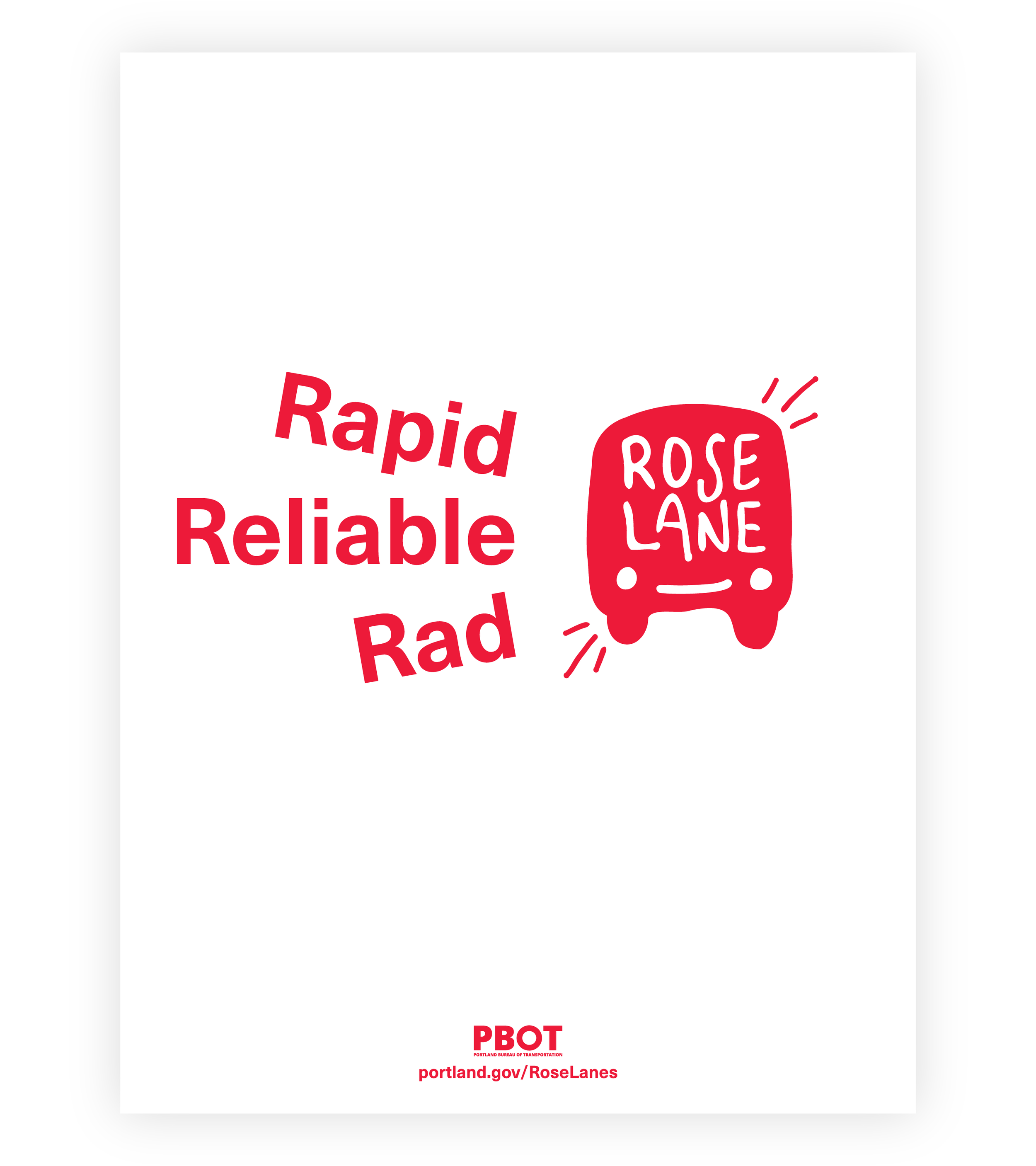
The Portland Bureau of Transportation (PBOT) asked us to create a brand system for RoseLane, a city-wide network of special traffic lanes that give buses and streetcars priority on the road, helping people move more reliably and quickly.


Working with multiple stakeholders, we invested in defining goals and objectives for the brand. Being the first year of COVID, making people smile was one key priority.

Internally named “Rosie” the logo was designed to personify a Portland bus/streetcar in motion. RoseLane Red, is both friendly and fast. 

White poster with a red rose lane logo and the words rapid, reliable and rad next to the logo.
Red poster with a smiley face made out of the words "let's ride RoseLane."
White poster with a red RoseLane logo in the top corner and the words "Let's Catch" leading up to it.
Red poster that reads "Hop on RoseLane" with motion lines around the word Hop.

Beyond the core brand assets, we identified key moments for PBOT to communicate the tone and benefits of RoseLane to the public. 

Three street light banner designs: all three show the logo on one side. On the other side, one reads, "Rapid, Reliable, Rad." The second reads, "Let's ride RoseLane." And the third, "Nice ride."
Red RoseLane banners on lamp posts on a street in downtown Portland.

Special thanks to the collaborative stakeholders from PBOT and TriMet that brought this brand experience to life!


Project Team

Client Team
John Brady, PBOT
April Bertelsen, PBOT
JC Vanetta, TriMet
Jamie Snook, TriMet
Brenda Martin, TriMet

Photography
TriMet

sparks+sullivan Role
Brand Identity System + Toolkit
Brand Experience Recommendations

Did we miss a detail or shout out? Email us
and let us know! hello@sparkssullivan.com

Previous
Previous

Leach Botanical Garden

Next
Next

Gateway Green